Tag: Bold colours

  • How Using Blocks of Colour can Transform a Room

    How Using Blocks of Colour can Transform a Room

    Style stories

    How Using Blocks of Colour can Transform a Room

    It might remind you of a Mondrian abstract painting or the opening title graphics of a 1980s TV game show, but colour-blocking is a retro design technique that is enjoying a resurgence in interior design today. Pairing two or more solid, often bold, bright colours with geometric shapes and sometimes black and white stripes has been around in art and fashion for a century, but only really in interiors since the 80s when it burst out of the Milan scene. Despite the obvious links to that primary-coloured decade, when done well, colour-blocking can make a stylish, affordable impact in the home.

    It’s not an interior design trend for everyone, but if you’ve ever confidently gone out wearing a neon pink skirt, a turquoise top and yellow shoes, then you’ve got what it takes to use blocks of colour to transform any room in your house. Before you dismiss the idea because you don’t want your living room to look like a primary school classroom, keep reading, because making a bold statement can simultaneously be subtle. Anything can be your canvas for block colour – you don’t have to divide your walls into quarters and layer on the poster paints. Window recesses, drawer fronts, doors, and even floors, can all be used to stunning effect with block colours.

    Colour blocking is the art of combining two or more colours in one area. Back in the day, these were more often primary colours, but today there are no real rules, in fact, sometimes the more surprising combinations are the most effective, as long as you stick to a limited palette. Think pink cushions on a red sofa, or an orange handle on a dark green door. It’s subversively stylish, often going against other design principles, yet instantly noticeable. It can enliven a bland space, negate the need for expensive wall art, and highlight the features in your home in a clever way. Here are some areas you can consider:

    Colour Blocking – Bedrooms

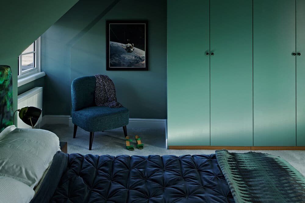
    Steer clear of the bold colours and contrast muted shades instead for a more soothing overall feel. You can use blocks of colour with pastels or by introducing a thin stripe as your contrast, and it will still have an impact.

    Dressing room in our Old School House project (click here to find out more)

    Colour Blocking – Kitchens

    There’s no rule that says that all kitchen units have to be the same colour. Consider a run of doors in your chosen palette, tied to accessories elsewhere in the same colour. Or go two-tone with upper and lower cupboard doors. You can even alternate drawer fronts for a more restrained look.

    We love @Oxfordone’s colourful Instagram feed!
    More muted colour blocking in Geordie Jen’s Abode kitchen

    Colour Blocking – Architectural Features

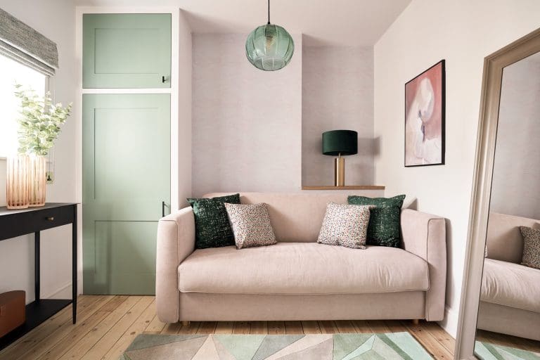
    Window frames painted to contrast with the wall colour are a great opportunity to try out colour-blocking, as are wall recesses. There’s no limit to where you can dip your toe into the technique, as long as you take a holistic view to maintain harmony. Even random blocks of a herringbone floor work well. Consider the effect of light switches and plug sockets in a contrasting colour to your wall as a rebellious taster if you don’t feel you can go all the way!

    Gorgeous muted green window frames in one of our projects in Dorchester, with pink dining chairs adding a burst of colour.
    Add pops of colour in bedrooms with headboards, cushions and beautiful light fittings.

    Colour Blocking – Furniture

    As with the kitchen cupboards, blocking can work on other pieces of furniture too. Many period wooden doors have four panels that are crying out to be painted in different colours. Flashes of colour in unexpected places are also fantastic – the inside of a wardrobe clashing with the carcass, for example.

    Colourful furniture and alcove by @Oxfordone

    If you want to know more about how to use blocks of colour in your home or have seen any examples that you love, let me know! And check out my Interior Design services here.
  • Working With Bold Colours and Patterns

    Working With Bold Colours and Patterns

    Style stories

    Working With Bold Colours and Patterns

    Have a scroll through a property website and compare a dozen living rooms – notice how those with colour, patterns and accessories look more comfortable, stylish and inviting, than the magnolia empty ones? Then look at the real standout ones – I bet they feature some vibrant colour somewhere, because bold colours are very definitely on trend. (Check out our blog post earlier in the year on interior design trends for 2020). That said, it would be a crazily daunting leap for anyone to immediately start painting their white bedroom walls blue or their kitchen bright green, so how do you choose when it comes to bold colours and where should you begin?

    The Basics

    As always, you’ve got to take a step back and look at the canvas you’ve got to work on – the size of the room is an obvious starting point. In a small space, four block colour walls will be overpowering, so an accent wall will be your style statement.

    Larger rooms can handle complete colour, but again, too many contrasts elsewhere in the space will be visually overwhelming. Then consider where you want to make your colour statement – bold colours are often used successfully in rooms where you want to make an impression, so a living room or an entrance hallway are popular, and any kitchen diner that entertains or is the hub of the house will also work. It’s less common in bedrooms where you might prefer a more calming environment.

    The wall in this kitchen diner makes a real statement but we kept the surrounding walls neutral so that it isn’t too overpowering – see our Abel Gardens project.

    The Palette

    Bold colours always need something to play off, which is where your colour wheel from your old school art class comes in handy! You need to consider complementary hues, as well as the same harmonious tonal family. You can see plenty of examples in fashion, art and even nature. Whether you’re a fuchsia and olive-green person or a navy and orange fan, don’t dive in straight away, plan carefully and don’t forget your neutral shades.

    It’s always a good idea to lay out your swatches together to see how your design will work.

    The eye needs some respite in a bold colour room, so use your most vivid colour as an accent colour only. Designers often use a 60/30/10 rule for dominant/secondary/accent colours and it’s sage (a good neutral!) advice to achieve the right balance. If you’re nervous about choosing your colour scheme, then don’t forget to test things out – a step up from a paint tester pot is to spray paint an old piece (a wooden chair, say) in your bold colour and see how you feel. Another great way of deciding which colours work together is by picking them from an existing pattern that you like and can incorporate, which leads us nicely onto:

    The Patterns

    Pattern is the ultimate unifying device for your colours and can single-handedly bring a design together in one well-chosen accessory. When done well, you might not even notice that an intricately patterned cushion on a neutral sofa is cohesively marrying both the wall colour, a rug, and your vibrant chosen accent colour. While I’m not suggesting you base the room’s entire scheme around a cushion pattern, they are a great inspiration if you’re stuck. Textiles are the best place to incorporate pattern, and they often throw texture into the mix too, which is great. As for the pattern design itself, a lot will be personal choice, but botanical patterns work well with greens and earth tones, for example, and graphical designs suit more architectural black and white and greys.

    The botanical print on this much loved armchair helped inspire the design for the rest of the room in our Littleton Street project.
    This is the whole living room – notice the accent colours from the armchair pattern picked up in the soft furnishings.

    So, don’t be afraid of bold colour – just remember that it needs its friends to make it thrive. And if you’re really stuck, call your friendly interior designer, because we love it!