Author: Kate

  • How to choose the ‘right’ white for your room

    How to choose the ‘right’ white for your room

    Style stories

    How to choose the ‘right’ white for your room

    White is still the most popular, go-to colour for redecorating a room

    Back in the 1940s, a new formula for paint arrived on the scene. Titanium dioxide was added creating a really strong, lasting bright white, and it resulted in an explosion of new interior schemes. It really took hold in the 1960s and we’ve been loving it ever since!

    It can certainly be the perfect blank canvas… if you choose the right tone! If you don’t, you’ll be sitting in a stark, clinical, cold space. Why? Because white isn’t just white. There are hundreds of white paints on the shelves, from brilliant white to off-white to white-with-a-hint-of-whatever and the differences between them are enough to give a room a completely different feel. The trick to finding the right white for your space involves understanding undertones and picking which suit both the natural and artificial light in your room, as well as what you’re going to put in it.

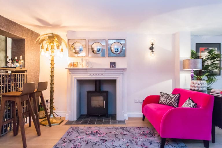
    The bar area from the Ferry Road project

    See how natural light from the right makes that side of the room look cooler compared to the very warm tones created by the floor lamp?

    Grab some testers

    A bright reading corner from the Crowell Hill project

    Looking at different whites on screen or on swatch cards won’t really help you get to grips with pigments and undertones but tester pots painted onto a wall really do! If you buy a selection of them, as well as a pure brilliant white as a reference point, and paint them next to one another on the wall, you’ll start to see the subtle differences in the grey, pink, yellow and other undertones. Look at them at various times of day too, under both natural and artificial light, and you’ll begin to realise that some don’t work at all in your room and others do.

    Grab your compass

    North-facing rooms typically feel colder and darker, so you will need to choose a paint with warm undertones of yellow and red that will warm things up and bounce light around more.

    South-facing rooms are naturally bright and sunny, so need no warming up and can happily handle blue or grey undertones.

    Handy tip: To make life easy, you can get a Compass app on your phone!

    Light coming from east or west?

    Would you believe it if I told you that in the image here, there is only one paint colour on the ceilings? In the long room of the current Fulham project, there is a large window at both ends, one facing east and one west. Guess which side the morning sun is coming in from? I haven’t had to put any filters on this photo-there’s no need to make my point!

    With full sun streaming in, you can see just how warm the east facing side becomes. In this particular situation, we decided that as the living room will be used mostly in the evening when the sun is setting, we could afford to use a bright white (Little Greene’s Flint to be precise) in both spaces but just imagine how yellow it would all look if you used a warm tinted white here?

    Grab your interior designer!

    Before you slap your carefully chosen white everywhere based on the room orientation, it’s worth pausing to consider your intended finished room design, as this can also influence your choice of white. For example, a living room with warm toned colourful sofas, artwork or rugs would work best with a warmer white, while a minimalist Scandi vibe might warrant a cooler tone.

    Designers are great at maximising the dimensions and architectural attributes of a space and sometimes (just to confuse things) combining variations of white on woodwork, features or ceilings, can actually enhance the proportions or the period features of the room.

    A view through to the dining area of the Ferry Road project

    I hope all that helps you make the white decision…(sorry!)

    Before you head out and buy that 10 litre pot of paint, if you want some advice from me, I offer hourly consultancy to give you peace of mind.
  • Beautiful, Artisan, Italian homewares-  An interview with Allóra

    Beautiful, Artisan, Italian homewares- An interview with Allóra

    [et_pb_section admin_label=”section”] [et_pb_row admin_label=”row”] [et_pb_column type=”4_4″][et_pb_text admin_label=”Text”]

    Style stories

    Beautiful, Artisan, Italian homewares- An interview with Allóra

    I am always on the look out for new beautiful brands, so that I can offer ‘just the right piece’ in my projects. Discovering Allóra was a joy! Read on to discover a little bit more of what I found!

    What is the story of Allora?

    AllÓRA was born out of our passion for beautiful aesthetics and exceptional quality combined with our love for bringing stylish designs and unique wares to people. As we drove around Italy, we would come across beautiful little towns and villages and stock up on the gorgeous items we found. We made a personal selection of the very highest quality Italian textiles, ceramics, glassware and cookware for our own home, which we then wanted to share. We still do this by travelling through Italy, meeting artisans and spending time at their studios. We talk with them about their history, their influences and their approach. We discuss the things they create and we propose ideas for new creations they could potentially craft with and for us.

    What inspires your designs and collections?

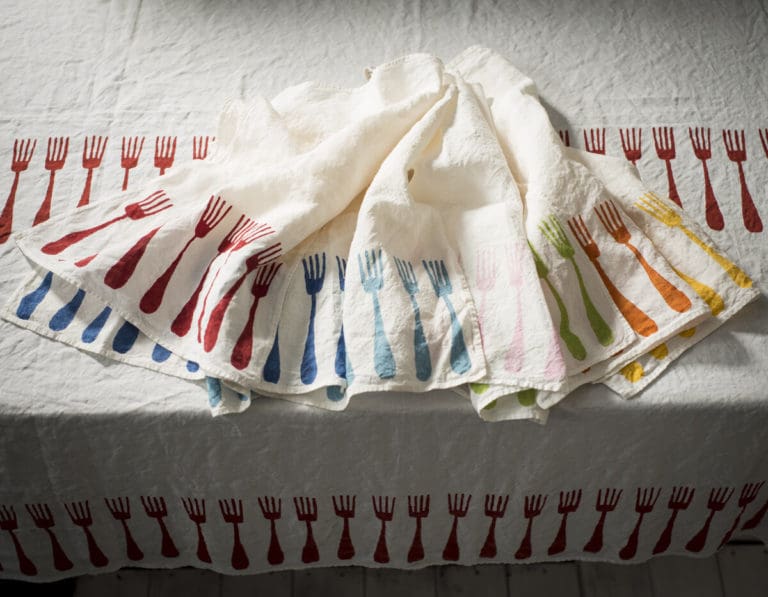
     We are from a beautiful region in Italy, Emilia Romagna, known for its gorgeous landscapes, medieval cities and beaches – a brilliant mix that we try to bring into and share through our collections, ideas and themes. As you will see from our pieces, we try to use a variety of styles and designs that work together. All of our items are handmade, using traditional techniques and the full process from designing collections to producing them is very organic. Our luxury linen tablecloths and designer tea towels showcase our approach in particular. Gorgeous fabrics, some woven over 70years ago, have beautiful and varied patterns and rich colours . These, in particular, very much sum up what AllÓRA is about.

    What interiors inspire you professionally and personally?

    Much like our creations, we have a strong appreciation of interiors that are charming and full of personality. In Italy we have a beautiful home in the countryside, surrounded by luscious fields and gorgeous mountains. For us, interiors that are clean, spacious and blend the contemporary with the traditional are inspirational.Think of rustic sophistication. Beautiful textures, open spaces and well thought out colour schemes are our favourite!

    What trends do you see for dinner parties and events?

    With what has happened in this past awful year, many of our clients tell us how keen they are to once again invite friends and family over for a dinner party. As we approach spring and summer this will undoubtedly become easier. However, we think that large parties and gatherings will be less common, as people seek more intimate and cosy settings. And since the British weather is so unpredictable, we think that al-fresco gatherings will be how many people choose to celebrate, whether as an event in the garden or as an outdoor dinner party. 

    Thank you so much to AllÓRA for taking the time to speak with me. For more information and to discover their beautiful goods, visit AllÓRA would like to offer a big thank you to Kate for taking the time to speak with us. For more information and to discover her beautiful projects, visit Allóra.

    [/et_pb_text][/et_pb_column] [/et_pb_row] [/et_pb_section]
  • 3 top tips to make your interior project a breeze

    3 top tips to make your interior project a breeze

    Style stories

    3 top tips to make your interior project a breeze

    When you’ve made the decision to redecorate or redesign your home, it’s such an exciting time and who doesn’t want to dive straight in? BUT, if I can give you one piece of advice for that exact moment it’s ‘STOP’ and step away from the paintbrush. Why? Because it’s super important that every aspect of your project is planned before you start.. this is the key to a great interior!

    Here are my 3 top tips for interior project success:

    1. Take the time to define your style

    Most people either like to think that their individual preferences mean that their own style is unique, or they don’t believe that they have one. The truth is that the majority of looks come under an established banner in interior design terms and the best way to confirm yours is to start by looking at your own home. Note the pieces you love and those you don’t. Think about the wall colour, the floor, the fabrics and see what you’ve been drawn to over time, chances are that a theme of some sort will come through. Then browse online at your dream homes and spaces and see if your aspirations have a theme. You might find that you start to see certain labels cropping up, like Scandi, Vintage or Colour-Blocking . These labels are your “style”. If you notice that you’re drawn to exposed brickwork, metals and greys, then Industrial could be your thing. If your vibe is more layered textures, up-cycled furniture and gentle colour then rustic or Spring style could be you.

    Don’t worry, you don’t have to align yourself with one style if nothing is obvious but a great next step is to create a mood board on Pinterest and gather together images you like then move to finishes, fabrics and furniture. By the end of this process you’ll see your style come through and you’ll have a much better idea of a design direction that is all YOU!

    2. Choose your colour palette and use the 60 / 30 / 10 rule

    I’ve talked about colour in lots of blogs before (but I’m going to do it again!) as it’s my second top tip for interior design project heaven. Before you hit the DIY stores you absolutely need to establish the ideal colour palette that works for you and your family. I’m a big fan of the classic 60-30-10 decor rule.

    It goes like this…60% of the room should be a dominant colour that creates the mood for the space that you want. 30% should be the secondary colour and the last 10% should be for accents only.

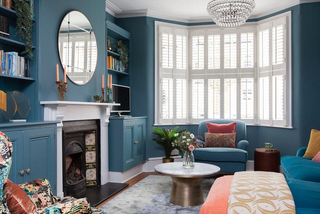
    My Littleton Street living room is a great example of the rule in action. The pale blue on all walls, cupboards and sofas create a cool sophisticated vibe for 60% of the room. White gives contrast to the ceilings, windows and fireplace at 30% and the accessories like throws and cushions pop-out beautifully at 10%.

    Follow this rule and you won’t go too far wrong with your project!

    3. Select items that work for you and zone your space

    The furniture and accessory pieces you choose in your design might centre around existing things you’re keeping (or a new one you’ve had your heart set on) but they should all reflect your lifestyle and how you want the room to function. When you start to research your chosen style, you’ll be inundated with furniture and accessory suggestions which can be overwhelming. So again stop and focus on what’s really important in the space, get a pen and paper out and zone your spaces according to the activities that will be carried out in them.

    Once you’ve got your zonal plan together choose your furniture and accessories to meet the needs of the room, that way you’ll shop and spend so much more effectively and that’s what we all want isn’t it?

    Every good interior design project should have a cohesive look and feel, so try these steps before you begin your next design adventure, they’ll pay you back in spades!

    And don’t forget…

    If you need a bit more help, my ‘How-To Guides show you exactly how to recreate some of my favourite interiors look in your home.

    It’s my job to read between the lines and bring your vision to life, so if you have a project you think I could help with, I’d love to hear from you.

  • Bold vs Neutral…there’s room for both in your home!

    Bold vs Neutral…there’s room for both in your home!

    Style stories

    Bold vs Neutral…there’s room for both in your home!

    If you’re a regular reader of my blog, you’ll have seen plenty of daring design ideas, bold colour suggestions and eclectic looks. But that doesn’t mean that those are the only styles I like, or the only jobs I do for my clients. In fact I use more neutral colours in many of my schemes to create a different mood or atmosphere so in this blog I’m going to show you how to take the understated elegance of a neutral colour palette…and give it a special Kate Lovejoy twist!

    The dressing room from The Old School House

    Neutral colour provides a calm base to work from

    Even though the term ‘neutral’ implies no colour at all, there are enough undertones in the hundreds of shades of white, beige, ivory, taupe or sandstone that we can treat them as seriously as an other colour. This is especially true when it comes to designing the palette for an interior scheme. Neutral colours provide a calm base to either build upon with bolder elements or to support a wholly neutral feel. Dulux’s Colour of Year 2021, Brave Ground, is a neutral shade that they have called “the cornerstone of decorating”, which underlines how important and effective a neutral can be.

    Using the same interior rules as we would with strong colours, ie 60% dominant, 30% secondary and 10% accent, a neutral palette can easily be as stylish as a ‘colourful’ design. Staying within a tonal palette is also important – picture a hint of petrol blue or gold and a touch of black or brown across an all white chalky base for example. Then applying other principles that I’ve also mentioned before like textures, layers, and unique pieces of art and you’ve got the most elegant, relaxing neutral interior…but with a twist!

    The Master bedroom from The Courtyard project

    The natural lighting of a room can help direct your colour choice

    When it comes to choosing your starting point, your primary neutral, the first thing to consider is the natural light in the room. In a north-facing room, straight up white isn’t going to cut it and will struggle to lighten the space. The cool toned natural light will showcase the cooler tones of a colour, so you should either embrace that and go down a sophisticated grey/green route, or better still counteract it with warmth, using neutrals with rich undertones. Similarly, your accent colour will need to perform the same function, so blues and greens for the cool approach and spicy rich colours to warm up a room.

    The dining room from The Courtyard project
    The living room from The Old School House

    So, if you’re struggling to decide on a colour scheme for your next interior design project, or you want to create a zen calm, natural environment to escape the hectic world outside, why not consider my take on a neutral look? It will stand the test of time and always look stylish, then while everyone else chases the latest trends and frantically redecorates year after year, you can take a deep breath and relax…!

    And if you need some help and guidance, drop me a line to see how I can help!

  • Everything you need to know about eco-friendly paint and why it is better for you too

    Everything you need to know about eco-friendly paint and why it is better for you too

    Style stories

    Everything you need to know about eco-friendly paint and why it is better for you too

    Do you remember the days when the smell of ‘fresh paint’ in your home signalled a freshening up of your decór? None of us really had any idea that this smell was actually toxic fumes, doing us no good whatsoever!

    I’ve blogged before about sustainability in interior design ( read here) being part of a larger cultural shift towards a more environmentally conscious way of living. Fortunately, sustainable choices are becoming easier to make everywhere we look, and one area that affects my design world is the rise of eco-friendly paint.

    I know what you’re thinking: paint is a manmade product, so how can it ever be truly eco-friendly? Well, while you’re correct to a certain extent, there are paint companies out there producing paint that has a minimal impact on the environment. Traditional paint is high in toxins, plastics or chemicals, so, what exactly makes a paint eco-friendly and what do we need to look for?

    As yet, there is no clear definition of what constitutes ‘eco’ or ‘natural’ paint or any accreditation for the paint industry, like they have in timber, for example. This means that paint companies can use the word ‘organic’ purely because there are some plant-based ingredients, so it’s important to drill down deeper and look at the small print, particularly in terms of how it is made and what exactly is in it.

    The manufacturers

    There are many companies large and small who are now offering a healthier, more sustainable alternative to the chemical paints we’ve been used to. Here are a few of my favourites- each one has written about their credentials, which I have linked to under each image

    Click for more here
    Click for more here
    Click for more here
    Click for more here
    Click for more here
    Click for more here

    The ingredients

    You should be able to read this on the paint tin itself but expect to see plant-based oils like linseed; waxes; clays; and chalks or limestone. You might also spot casein, a milk protein, taking the place of other petrochemicals. It’s a bit of a minefield that is crying out for regulation because some of the products involved in regular paint manufacturing that can cause health problems are from natural sources and therefore could be considered organic. Not everything that is naturally occurring is healthy of course – turpentine comes from a plant product and is carcinogenic. Be wary too of the phrase “water based”– some manufacturers are able to use this when it really only means “watered down”. 

    Volatile Organic Compounds (VOC)

    Paint, as well as brush cleaners, primers and spray paints are the second largest contributor of VOC emissions after the motor industry. VOCs can be harmful and trigger allergic reactions and asthma. They also stick around for years after paint is dry. The government did change the rules on VOC levels in retail paint some time ago, so it’s no longer enough for a company to claim a paint is eco-friendly just because of a low VOC, given all paints are low now. VOCs are another grey area sadly, where natural paint suppliers will go as low as they possibly can, and other manufacturers contend that no paint can be truly VOC-free. And even if it did achieve zero VOC’s, it still doesn’t mean it’s eco-friendly if the other ingredients are wrong.

    If the trend for sustainable practices and demand for natural paint grows, then industry wide standards will surely follow. In the meantime, for those us trying to live as eco-consciously as we can, it’s good to know that there are benefits to be had from spending some time choosing eco paint. Those with the lowest VOCs will least impact our health, and for homeowners with old properties, natural paint offers excellent breathability for our walls and is a natural mould repellent.

    Lastly, bear in mind your own waste generation on your next DIY project – most unused paint has to be incinerated or ends up in landfill sites, so try to estimate your litres and coverage as best you can – or ask your friendly interior designer to help!

  • 6 easy ways to warm up your grey room using the latest trends

    6 easy ways to warm up your grey room using the latest trends

    Style stories

    6 easy ways to warm up your grey room using the latest trends

    You’ve probably noticed that all the magazines are filled with the latest trend towards warm, earthy tones, inspired by nature. If you want to do a little update but your sofa and walls are grey (because that was all the rage not that long ago!) what do you do?

    I’ve got 6 ways you can change things up a bit, using the latest trends without having to start from scratch.

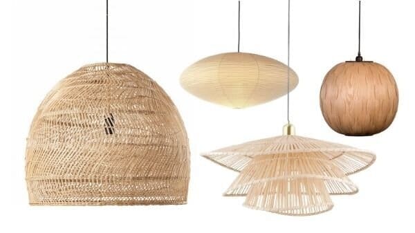
    1) Add natural wood elements

    Wicker, jute and rattan are all on trend right now. The natural warm tones will help to soften things up. Try places like Maison du Monde, Made, Dunelm and H&M and Nordic Nest for side tables, trays and lighting.

    From L to R- Maison du Monde, Heals, Made and Naken Interiors

    2) Warm toned lighting

    One of the easiest changes you can do to make your room feel cosier is to make sure your bulbs are warm in tone. Natural light will of course affect the feel of a room. If it’s north facing or doesn’t have much natural light, a room will feel naturally cooler, so a grey wall may feel even greyer.

    But once that daylight has gone and you are relying on artificial light, make sure you have a few table and floor lamps to instantly create warm spots in the room.

    Carla @houseofbeau13 has got it right with warm light and lots of natural finishes

    3) Bring in the green plants!

    It’s not a new trend to have houseplants of course, but they can sometimes be forgotten as a great way to bring natural colour and form into a space (as well as all the therapeutic qualities of course!)

    Planters from Cult Furniture

    If you don’t have lots of space, try grouping small succulents together like this, they have gorgeous subtle tones in them.

    4) Use highly textured finishes

    Don’t use shiny fabrics but go for textured finishes like wool and slubby linen to give a more relaxed look.

    Bring in layers of texture with rugs and mis-matched cushions.

    A perfect example of a relaxed look by Studio Milne

    5) Colours to use with grey

    Most yellows work with grey from soft ochre greys through to mustard and gold tones.

    Using a grey base from the Glade Road project

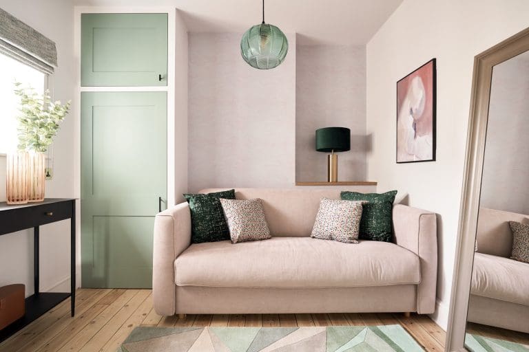
    We used a pale pink and a rattan pendant in this snug below . In fact most of the rooms at the Glade Road project had a pale grey background which you can see here– have a look as there’s lots of ideas!

    Using pale pinks in the Glade Road project

    6) Metal finishes

    The obvious one to go with grey is chrome but if you want to warm things up think about changing to brass- not as bright as gold but will warm the palette up.

    Image courtesy of Skona Hem

    So there you have it! 6 ideas to warm the greys without having to get the paintbrush out!

    If you’d like to see more ideas like this, then my monthly newsletter ‘The Bold and The Brave’ is packed with ideas! Sign up here and get the free download ‘10 tips to make your interior scheme amazing!’

    And of course, if you need any help, anything from needing some help with the right colour paint to a full blown renovation project and anything in between, let’s have a chat today! You can send a message here!

  • How Using Blocks of Colour can Transform a Room

    How Using Blocks of Colour can Transform a Room

    Style stories

    How Using Blocks of Colour can Transform a Room

    It might remind you of a Mondrian abstract painting or the opening title graphics of a 1980s TV game show, but colour-blocking is a retro design technique that is enjoying a resurgence in interior design today. Pairing two or more solid, often bold, bright colours with geometric shapes and sometimes black and white stripes has been around in art and fashion for a century, but only really in interiors since the 80s when it burst out of the Milan scene. Despite the obvious links to that primary-coloured decade, when done well, colour-blocking can make a stylish, affordable impact in the home.

    It’s not an interior design trend for everyone, but if you’ve ever confidently gone out wearing a neon pink skirt, a turquoise top and yellow shoes, then you’ve got what it takes to use blocks of colour to transform any room in your house. Before you dismiss the idea because you don’t want your living room to look like a primary school classroom, keep reading, because making a bold statement can simultaneously be subtle. Anything can be your canvas for block colour – you don’t have to divide your walls into quarters and layer on the poster paints. Window recesses, drawer fronts, doors, and even floors, can all be used to stunning effect with block colours.

    Colour blocking is the art of combining two or more colours in one area. Back in the day, these were more often primary colours, but today there are no real rules, in fact, sometimes the more surprising combinations are the most effective, as long as you stick to a limited palette. Think pink cushions on a red sofa, or an orange handle on a dark green door. It’s subversively stylish, often going against other design principles, yet instantly noticeable. It can enliven a bland space, negate the need for expensive wall art, and highlight the features in your home in a clever way. Here are some areas you can consider:

    Colour Blocking – Bedrooms

    Steer clear of the bold colours and contrast muted shades instead for a more soothing overall feel. You can use blocks of colour with pastels or by introducing a thin stripe as your contrast, and it will still have an impact.

    Dressing room in our Old School House project (click here to find out more)

    Colour Blocking – Kitchens

    There’s no rule that says that all kitchen units have to be the same colour. Consider a run of doors in your chosen palette, tied to accessories elsewhere in the same colour. Or go two-tone with upper and lower cupboard doors. You can even alternate drawer fronts for a more restrained look.

    We love @Oxfordone’s colourful Instagram feed!
    More muted colour blocking in Geordie Jen’s Abode kitchen

    Colour Blocking – Architectural Features

    Window frames painted to contrast with the wall colour are a great opportunity to try out colour-blocking, as are wall recesses. There’s no limit to where you can dip your toe into the technique, as long as you take a holistic view to maintain harmony. Even random blocks of a herringbone floor work well. Consider the effect of light switches and plug sockets in a contrasting colour to your wall as a rebellious taster if you don’t feel you can go all the way!

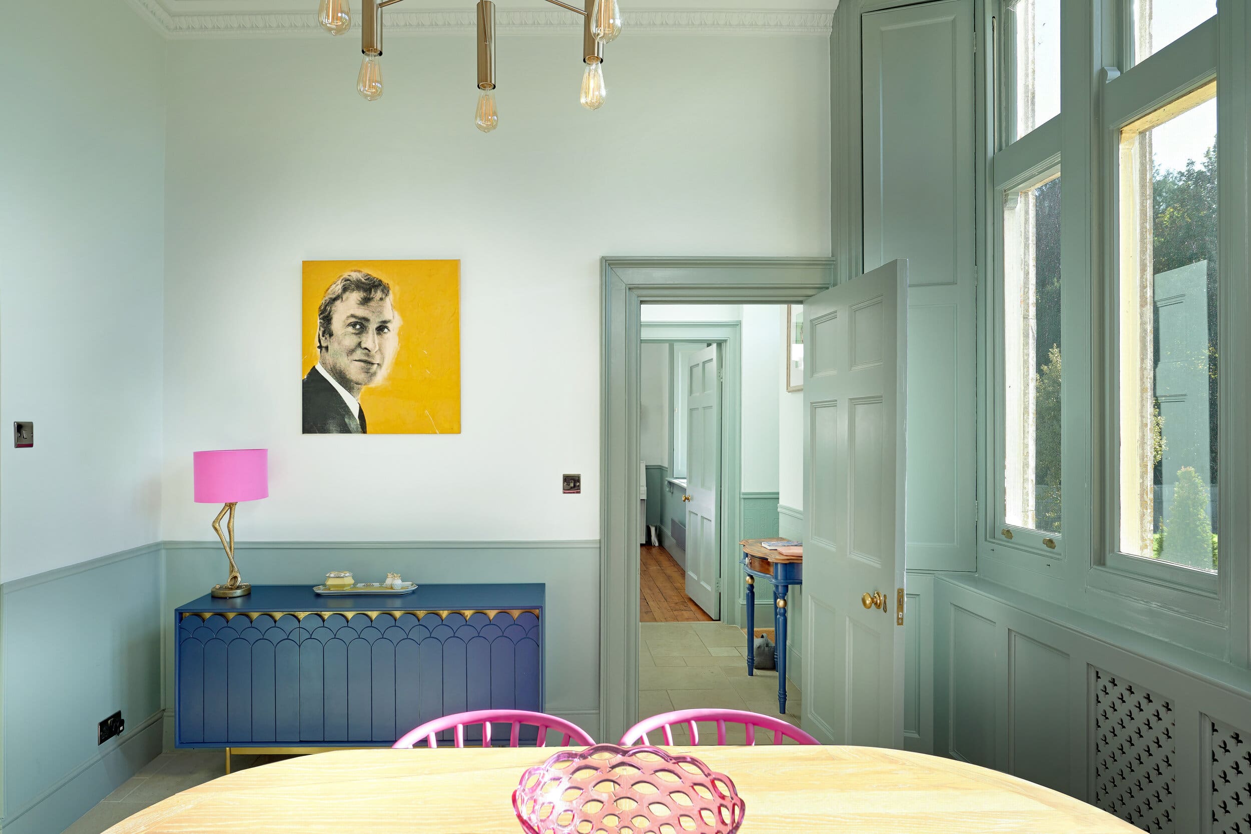
    Gorgeous muted green window frames in one of our projects in Dorchester, with pink dining chairs adding a burst of colour.
    Add pops of colour in bedrooms with headboards, cushions and beautiful light fittings.

    Colour Blocking – Furniture

    As with the kitchen cupboards, blocking can work on other pieces of furniture too. Many period wooden doors have four panels that are crying out to be painted in different colours. Flashes of colour in unexpected places are also fantastic – the inside of a wardrobe clashing with the carcass, for example.

    Colourful furniture and alcove by @Oxfordone

    If you want to know more about how to use blocks of colour in your home or have seen any examples that you love, let me know! And check out my Interior Design services here.

  • How I broke the rules of decorating a barn conversion

    How I broke the rules of decorating a barn conversion

    Style stories

    How I broke the rules of decorating a barn conversion

    Most days I walk my dog over the same fields and a couple of years ago, I watched with interest as some local farm buildings were developed into luxury barn conversions.

    Photo credit- Savills

    I watched them sell one by one and being the nosy person I am,  thought I’d love to look inside one!

    Well last year, Claire gave me a call. She said she lived locally in a barn conversion… and you guessed it! It was one of those barns!!

    She had seen my Littleton project in London (see it here) and loved the bold colours I’d used. She assumed that I was London based, wondering if I would head out to the rural parts of Berkshire but then in another moment of serendipity, she discovered that I live 5 minutes away! She asked if I could help her to decorate her living room.

    The house is as beautifully appointed as it is large and although there are some lovely features… lots of oak and iron work inside, all the rooms were painted the ubiquitous cream. Nothing wrong with that of course but Claire wanted to push the boundaries a bit.


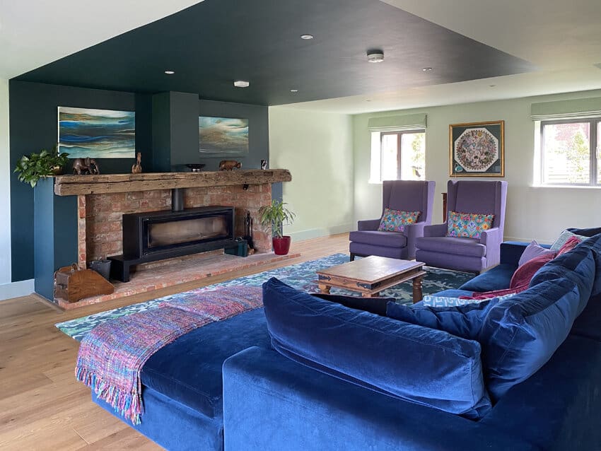
    The living room was over 7.5m square, had a 3m long deep blue corner sofa and an equally long fireplace. Claire wanted something unexpected but practically, a space for a family games table and a bar as well as the living area.

    Image courtesy of Dulux

    These were my first thoughts:

    ·      This room is so wide, it makes the ceiling look quite low, so if I was just to suggest painting the walls a bold colour, the ceiling height would be even more accentuated as it would feel like a ‘lid’ on the room.

    ·      We naturally arrange furniture into a space that works socially and comfortably; so even in this large room, the sofa and armchairs were sort of floating in the middle of the room, unanchored to each other or any of the surrounding furniture.

    ·      Claire had shown me some reference on Pinterest (which was really useful) but they were generally of tall Georgian proportioned rooms with panelling which would not have translated well into this space.

    ·      The focal point of the room is the fireplace and the areas of wall available for artwork were all on the back wall- not so good for the scheme!

    To me, the first thing was to deal with the illusion of a low ceiling and to come up with a style that would do that. Then to look at the layout and then the colour scheme.

    (Not necessarily the way round that you might think!)

    Concept

    I knew that the trick was to blur the line between the walls and the ceiling.

    The first idea was to section the room with blocks of paint that would go up the walls and over the ceiling.

    The second was to use an ombre effect where there is a gradual fade from one colour to another.

    The third was to paint a bold line half way up the wall.

    Each of these ideas use the trick of having the same colour at the top of the wall as it passes on to the ceiling, so your eye is not drawn to the wall height.

     I discussed the advantages and disadvantages of each with Claire and she chose the first option.

    (There was a reason it was Option One!)


    With that style idea, I began to section the room with different fields of colour.

    Design

    At the same time as this was happening, we began to look at colour palettes and came across a wallpaper from House of Hackney called Majorelle. It seemed to have the opulence we were looking for, as well as being a really good match with the existing blue sofa.

    The question was how to use it in the scheme…

    House of Hackney Majorelle

    I commissioned Sarah at Relovedmcr to create 2 pieces for the scheme. One in the Majorelle paper-

    Here it is almost complete…

    And the other one in a Bethan Gray wallpaper called Nizwa which toned beautifully with the other paper.

    Again, here is a detail of it almost finished.

    For such a large room, I needed to use this beautiful colour palette elsewhere.

    As I mentioned before even though the room is large, there wasn’t really an opportunity to put a large piece of artwork on the walls…. however there was a huge space on the floor!

    I designed this rug using all the colours and then set about choosing the rest of the elements of the room to tie with this.

    This beautiful rug is a mix of wool and viscose and is part of my new collection (coming soon- watch this space!)

    And here is a little video to show the process of it being made in India.

    The finished scheme

    Here is the result!

    Can you see how the panels of paint help to visually divide up the large room?

    My idea with the central blue area, is that it creates a central zone in the room, starting with the sofa (which you see the back of as you enter the room) to the rug, then up the wall around the fireplace and the ceiling over. The feeling is that it visually envelopes you even though you are sitting in the middle of a large room.

    There are no formal plaster features in the room, such as cornice or ceiling sconces and so I had the coloured areas simply painted on the walls and ceiling without any beading (as you might expect in a period house) to give an overall more contemporary feel.

    The image below shows how the painted panels work across the room, 3 zoned areas but all complementing each other!

    I kept the curtains and blinds simple and colour matched them to the walls (so that your eye isn’t drawn to them and away from the central focal points).

    I hope you have enjoyed a little behind the scenes and how I developed this scheme.

    I’d love to hear what you think of it in the comments below and if you have a space you’d be interested in updating (it doesn’t need to be this big!) then please get in touch using the contact form here!

    Thanks for reading!

    Kate

  • How to be more Sustainable with your Interior Design Choices

    How to be more Sustainable with your Interior Design Choices

    Style stories

    How to be more Sustainable with your Interior Design Choices

    Sustainable, eco-friendly, green, they’re all the same thing, right? Nope. While they’re all positive moves in the right direction, there’s a big difference in their meanings. While eco-friendly products are better for the environment than ‘regular’ versions of the same; and ‘green’ practices try to minimise any negative impact on the environment, sustainability is all about the future. Much more than just recycling, it’s an ethos that ensures our choices and actions today don’t compromise the lives of future generations.

    It’s ironic that sustainability in building design and architecture is fast becoming adopted as industry standards, whereas their bedfellow, interior design, is still unregulated and, if anything, has helped to fuel consumption and a disposable culture that contradicts the aim of sustainability to use the planet’s natural resources diligently. The UK is attempting to reduce carbon emissions to zero by 2050, so along with every other sector, interior design needs to pull its socks up and get on board before its reputation is tarnished (I’m looking at you, fashion industry!) Happily, many interior designers are doing just that.

    Sustainability in interior design is about focusing our design principles on the bigger picture to help reduce energy consumption, pollution and waste. It’s about creating functional, aesthetically pleasing, stylish interiors with one eye on a positive future; being conscious about consumption to minimise impact on the environment; and designing for longevity, not just for trends. So, what can we do to put this into practice? Here are my top three things that help me make sustainable choices for my clients:

    1 . Materials

    Depending on the project, some of this may have been already taken care of by an architect, but if not, the materials used internally vary greatly in their environmental impact. For example, consider the different supply chains of locally quarried stone against marble imported from Italy. Similarly, the waste products in the production of regular loft insulation compared to the natural wool version are incredible. Selecting formaldehyde free plywood for surfaces; organic, water-based paint that has fewer toxins; and sustainable fabrics that aren’t chemically dyed are all positive choices you can make that will preserve global habitats by minimising water waste, limiting pesticide use, or restricting deforestation.

    2. Source

    Where your design materials and the items you choose for your home physically come from can have a significant impact on sustainability. In the same way that the provenance of food has become an important consideration for restaurants, we need to consider how far our purchases are travelling: shipping long distances requires more fuel, more packaging and more labour. Wood is a great example of this. In the UK, we import 90% of our wood. Even though it might be from a sustainable forest on the label, that’s negated somewhat if the forest is in Denmark. Look out for the logo of the FSC (Forestry Stewardship Council) when buying wood as they are an international non-profit that will give you the most sustainable options.

    The same principles apply with the furniture and products we buy, which brings me onto their longevity and how to replace them less often and reduce our waste. Given trends come and go, why not consider a classic, more neutral design for larger items? For example, sofas going to landfill sites is costly all round, but many can be re-upholstered or restored to suit a new décor scheme, rather than rejected. It requires a mindset change, I admit, but it’s a much more environmentally friendly, sustainable way to style your interior.

    3. Light & Heat

    Again, this may be something to consider if it’s a larger refurb project that involves a build, but as well as the insulation we mentioned above, solar panels are becoming increasingly affordable and easy to install. Who wouldn’t want to heat their home for free and move away from other sources of energy with these two options in place? Secondly, when it comes to power usage for lighting, we’ve addressed this in previous blogs, but making the best use of natural daylight is an interior designer’s very first thought for a new project. It doesn’t matter if it means laying out a room completely differently, harnessing that natural light is a must. After that, a low energy lighting plan is a great idea. Analysing what goes on where throughout the house and providing lighting specific to tasks or usage is an energy efficient move that we should all be making. 

    Interiors journalist and writer Kate Watson-Smyth of Mad About the House has had the brilliant idea to compile a directory of companies that are ‘generally trying to do less harm’. From wood flooring to aluminium can radiators, rugs made from recycled bottles, carpets, kitchens, paint, wallpaper, fabric and soft furnishings. It’s a pretty long list but she says “it won’t be complete until we can add every company making anything to do with the home”. Have a look here, and enjoy some of the images of these sustainable products below.

    ArkOne Flooring specialises in luxury wood flooring that is 100 per cent sustainable.
    Bisque are making radiators from recycled aluminium.
    Recycled plastic bottle rugs from Claire Gaudion.
    Earthborn were founded in 2002 to provide environmentally-friendly designer breathable paints.

    Like everyone else, there is so much more that I could (and intend) to do, but we’re all learning as we go along our sustainable journeys and these ideas will hopefully encourage you to take those first steps. If you have more suggestions, I’d love to hear them!

  • Working With Bold Colours and Patterns

    Working With Bold Colours and Patterns

    Style stories

    Working With Bold Colours and Patterns

    Have a scroll through a property website and compare a dozen living rooms – notice how those with colour, patterns and accessories look more comfortable, stylish and inviting, than the magnolia empty ones? Then look at the real standout ones – I bet they feature some vibrant colour somewhere, because bold colours are very definitely on trend. (Check out our blog post earlier in the year on interior design trends for 2020). That said, it would be a crazily daunting leap for anyone to immediately start painting their white bedroom walls blue or their kitchen bright green, so how do you choose when it comes to bold colours and where should you begin?

    The Basics

    As always, you’ve got to take a step back and look at the canvas you’ve got to work on – the size of the room is an obvious starting point. In a small space, four block colour walls will be overpowering, so an accent wall will be your style statement.

    Larger rooms can handle complete colour, but again, too many contrasts elsewhere in the space will be visually overwhelming. Then consider where you want to make your colour statement – bold colours are often used successfully in rooms where you want to make an impression, so a living room or an entrance hallway are popular, and any kitchen diner that entertains or is the hub of the house will also work. It’s less common in bedrooms where you might prefer a more calming environment.

    The wall in this kitchen diner makes a real statement but we kept the surrounding walls neutral so that it isn’t too overpowering – see our Abel Gardens project.

    The Palette

    Bold colours always need something to play off, which is where your colour wheel from your old school art class comes in handy! You need to consider complementary hues, as well as the same harmonious tonal family. You can see plenty of examples in fashion, art and even nature. Whether you’re a fuchsia and olive-green person or a navy and orange fan, don’t dive in straight away, plan carefully and don’t forget your neutral shades.

    It’s always a good idea to lay out your swatches together to see how your design will work.

    The eye needs some respite in a bold colour room, so use your most vivid colour as an accent colour only. Designers often use a 60/30/10 rule for dominant/secondary/accent colours and it’s sage (a good neutral!) advice to achieve the right balance. If you’re nervous about choosing your colour scheme, then don’t forget to test things out – a step up from a paint tester pot is to spray paint an old piece (a wooden chair, say) in your bold colour and see how you feel. Another great way of deciding which colours work together is by picking them from an existing pattern that you like and can incorporate, which leads us nicely onto:

    The Patterns

    Pattern is the ultimate unifying device for your colours and can single-handedly bring a design together in one well-chosen accessory. When done well, you might not even notice that an intricately patterned cushion on a neutral sofa is cohesively marrying both the wall colour, a rug, and your vibrant chosen accent colour. While I’m not suggesting you base the room’s entire scheme around a cushion pattern, they are a great inspiration if you’re stuck. Textiles are the best place to incorporate pattern, and they often throw texture into the mix too, which is great. As for the pattern design itself, a lot will be personal choice, but botanical patterns work well with greens and earth tones, for example, and graphical designs suit more architectural black and white and greys.

    The botanical print on this much loved armchair helped inspire the design for the rest of the room in our Littleton Street project.
    This is the whole living room – notice the accent colours from the armchair pattern picked up in the soft furnishings.

    So, don’t be afraid of bold colour – just remember that it needs its friends to make it thrive. And if you’re really stuck, call your friendly interior designer, because we love it!

  • Why is Putting Personality into your Home so Important?

    Why is Putting Personality into your Home so Important?

    Style stories

    Why is Putting Personality into your Home so Important?

    In a nutshell, to answer the question right away, without personality a house will never be a home. It can be a tastefully decorated, beautifully equipped house, but without some added personality bringing it to life, it will never feel like a real home. Consider the replica living rooms and bedrooms you wander through on a trip round Ikea: ubiquitous art on the walls, plastic fruit in a bowl, all new and shiny, but zero personality. In the same way, there’s nothing worse than entering a home and having no sense of the people who live there.

    The best homes are full of personality, where the interiors reflect their owner. They are always more welcoming, authentic and vibrant than any blank, soulless canvas. That’s not to say the understated minimalist look doesn’t work, of course, as long as it’s also a true expression of the inhabitants’ lives, loves and personalities. Putting personality into your home is a principle that applies no matter where you live or what you live in. It doesn’t require the most sought-after postcode or bespoke furniture from the latest interior design magazine. It’s about showing an emotional link to your space through design decisions that come from the heart. And it’s why, as an interior designer, collaboration with a client is so crucial. I could design the interior of a house from top to bottom with no input from the owner, but my choices alone would never showcase their personality in the way that a single framed photo of their own would.

    So, how do you go about it? Where do you begin? How do you know what style or design trends accurately represent you or suit your persona? These are tough questions – so much so that you can actually hire interior designers who will use online personality questionnaires and artificial intelligence to pigeonhole you to a décor type! You’re an “organised, efficient perfectionist”? Great, go with the stripped-back minimalist look I mentioned above! While there are elements of truth in these algorithms – certain types of people do like shabby chic when others prefer Scandi – there’s often no need to physically pose these questions. Personality shines through in every decision or choice we make when it comes to interior design. The patterns we gravitate towards or the colours we prefer “fit” us; they are subconscious affirmations of our personality every time we show a preference.

    My advice is not to take a strict cookie-cutter approach, but to design and decorate using these personal choices, within the theories of interior design. If they happen to be in line with trends or styles, that’s great and can make complementing the look easier, but if not, it doesn’t matter. Trends come and go and are expensive to follow. As I’ve discussed before, your home needs to be a sanctuary where you can relax and be yourself. This means we need personal items or purchases that make the owner happy and suit their lifestyle. No strict rules also gives you the licence to have fun with your space – you can mix and match without pressure; repurpose much-loved pieces that help tell the owner’s story and reflect their personality; and go as crazy (or be as subdued) as you like!

    The images above are taken from some of our favourite projects where we have helped clients put their personality into their home, from a ‘swanky’ bar to bespoke rugs and artwork that has inspired a theme.

    If you need help putting your personality into your home while incorporating your treasured items do get in touch, we’d love to hear from you. We offer advice by the hour, interior space planning, a full design service as well as kitchen design, bespoke rug design and sofa & chair selection.

  • How to Make Your Bedroom a Sanctuary

    How to Make Your Bedroom a Sanctuary

    Style stories

    How to Make Your Bedroom a Sanctuary

    With a renewed interest in our own physical and mental well being these days, 8 hours sleep has become the new 10,000 steps a day, with our smartwatches tracking how well we do and reminding us of the importance of a good night’s sleep. On top of these 3,000 hours a year we (should) spend sleeping, our bedrooms are also a place we can relax and de-stress, after a long day. With that in mind, here are some design tips to turn your bedroom into a sanctuary where you will hopefully want to spend more than just 8 hours.

    Bedroom Interior Design – Colour

    Starting with the basics, to some extent this may depend on the décor throughout the rest of your house, but ideally in a bedroom you should aim for colours that calm you. Some people prefer the pure, serene vibe of whites and off-whites, while others need a darker, enveloping atmosphere to feel comfortable enough to sleep. It’s important to think about what works for you and makes you feel your calmest. Blues and greens are said to lower the heart rate, which if true for you, would be ideal sleep preparation.

    Calming colours in this master bedroom in our Spinfield project create a perfect bedroom sanctuary

    Bedroom Interior Design – Textures

    Incorporating different textures can add warmth, visual stimulus, and a touch of luxury. If you’re lucky enough to be able to incorporate any exposed brick or wooden beams, that’s great, but if not, consider some textured wallpaper on one or two walls, rather than four cold walls of paint. Then think about a mixture of fabrics, beyond your choice of bed linen. Rugs, throws, fabric lampshades or a linen window blind will all add a warm, luxe feel to a room where we want to indulge our senses.

    Add texture and layering when designing a bedroom – this is the master bedroom in our Glade Road project

    Bedroom Interior Design – Lighting

    When it’s dark, our circadian rhythms kick in and our bodies produce melatonin, telling us we need to sleep. It can be a tougher transition to get to sleep if we switch straight from a single, bright overhead light to lights out. Using multiple low-level light sources, such as bedside lamps with shades to diffuse the light, or a corner floor lamp, will help prepare us for sleep. Interior designers love symmetry and it’s also said to subconsciously soothe us, so we love a bedroom where we can place matching bedside tables and lamps. If you’re short on space or the tables are too small, you could equally install low-hanging pendants from the ceiling to the bedside, providing you avoid a bare bulb.

    Simple bedside lighting in the Littleton Street project

    Nature

    Talking of symmetry, earlier in the year I blogged about the current trend for nature in our homes, and the bedroom is a great place for bringing the outside in. Plants purify the air of course, but even imagery of nature or textiles with biophilic designs can have the same calming effect as nature itself. So, whether you’re green-fingered enough to go for full-on hanging or trailing plants from shelves; only brave enough for a cactus you can’t kill; or want to play it safe with wavy, natural patterns on a rug, try to incorporate some element of nature into your bedroom design.

    Bedroom Interior Design – Your ‘stuff’

    Tidying your bedroom (and possibly other rooms too!) is essential for creating a calming atmosphere as well as generating space and light. It’s time to decide what you actually need in that room, for example, is the armchair in the corner really used as a relaxing reading area or do you have three months of clothes piled on top of it? While it’s important for our eyes to wander across things we love, let’s make them carefully chosen pieces, such as art on the walls or beautiful objects, rather than shelves groaning with odd, mismatched items. You’ll be surprised how much more relaxing a pared-back, minimal bedroom can be!

    Declutter and create a space for everything in your bedroom sanctuary – this is the main bedroom in our Cranbook project

    Lastly, the star of the show

    All of these ideas won’t have their intended impact on your bedroom if you don’t like your actual bed. While I don’t advise you spend your entire (interior design!) budget on a new one, there are a few things you can do to improve what you have. Going for the best mattress you can afford is a priority, followed by some serious hotel-quality bed linen. If you don’t want to get a new mattress, then try a mattress topper for a new experience and to breathe new life into your current one (I did this recently and it has made such a difference!). Accessorise with a faux fur throw or some luxurious cushions. If you are intending to buy a new bed, then get one as large as the space allows, placing the headboard against a solid wall, with your eye on the symmetry possibilities mentioned above. Space under the bed will visually makes the room feel bigger, but if you need to opt for a divan in the interests of decluttering, then do it. If your room size allows, a bench at the foot of the bed will help anchor its position in the room and adds an additional, hotel-style luxury touch.

     The average person gets 6.4 hours sleep a night – let’s hope these tips get you nearer to the full 8!

    If you would like help to create your very own sanctuary get in touch today to book an initial consultation, I’d love to hear from you!

  • How to Bring Nature Indoors

    How to Bring Nature Indoors

    Style stories

    How to Bring Nature Indoors

    Humans as we know them today have been around for approximately a couple of hundred thousand years. 99% of that time was spent living in the natural world, in agricultural societies – it’s only the last 1% when we’ve lived in artificial spaces that we have created ourselves. Most of our evolution therefore has involved a deep biological link to our natural surroundings and the hypothesis that we have an innate, genetic connection to nature is known as biophilia (from the Greek for “love of life”). This belief, that we psychologically respond positively to nature, also maintains that for us to benefit properly, it must be experienced repeatedly. And, in case you were thinking I’d changed profession, that’s the moment this stops being a history lesson and becomes an interior design blog again, with the concept of biophilic design!

    Image courtesy of Tom Raffield– himself a great advocator of biophylic design

    Most of us apparently spend over 85% of our time indoors, shut away from nature. Biophilic design is one strand of interior design that aims to improve our indoor spaces, such as workplaces and homes, by helping us to re-engage with nature. Regular readers of my blog will know that interior design isn’t just about colours and cushions; it encompasses materials, light, atmosphere and experience, and as such, it’s the perfect medium to incorporate multiple aspects of nature. But why should we? Why has it become such a trend in recent years? And why are the likes of Google, Amazon and Apple redesigning their workspaces to look like rain forests?

    The Benefits of Biophilic Design

    How does leaving your desk or your steamy kitchen to walk through a park or along a beach make you feel? For almost all of us, there’s a noticeable lift, some kind of subconscious kick we get from getting outside, even if it’s five minutes’ escape in a garden chair. Nature somehow helps us relax and de-stress. Countless studies show a range of physical and mental health benefits to having regular contact with nature – there’s even evidence to show that just touching real plants can have a calming effect, which is why so many people enjoy nurturing potted plants.

    Incorporating elements of nature into our modern-day indoor environment through biophilic design has been shown to reduce stress and decrease blood pressure, as well as aid creativity and improve mental well-being. Plants, as one example, help to clean the air and increase the humidity, but there are many more ways we can incorporate elements of nature into the interior design of our homes beyond a couple of cacti on the windowsill.

    Biophilic design – houseplants help induce a feeling of calm in the garden room of our Abel Gardens project

    Putting it into Practice

    One indestructible spider plant on a shelf isn’t going to cut it, I’m afraid! In terms of houseplants, you can’t really go over the top – big, small, leafy or structural – they all work as focal points or fillers of alcoves, but let’s take a step back from these living accessories and look at the bigger picture too.

    There’s no better way of bringing the outside in than by looking at it through a window, so maximising natural light and making the best of what you have, creating a space with some kind of view if at all possible, is the first step. Consider removing curtains that take up some of the window aperture; adding a window seat, perhaps; whatever you can do to see outside from your desk or your favourite chair. I know that not everyone has a view they want to look at, so there are other tricks of the trade we can deploy to help.

    Add a window seat to create extra seating and blinds that allow as much light in as possible. This is from our Ferry Road project.

    If you can’t look at rolling hills, the ocean, or a jungle of plants through a window, you can definitely enjoy a picture of it on a wall. Looking at art with biophilic themes has been shown to have the same calming benefits as the real thing, and we can also extend this from paintings to the designs that we choose in our wallpaper, fabrics and accessories. Botanical shapes and patterns are everywhere when you start to look for them, and they will all still give you that visual link to nature. Leaf prints, wave patterns and floral designs are abundant and using complementary colours common in nature – greens, blues, earthy browns and gold – will all add to your biophilic palette and ultimately a calm, stress-free interior!

    Incorporating houseplants, vases with flowers and botanical prints brings a sense of calm to this living room design by Kate Lovejoy Interiors

    If you would like advice on putting together a biophilic design for your interior, contact me to find out how I can help.

  • Why Tiles are Trending in Interior Design

    Why Tiles are Trending in Interior Design

    Style stories

    Why Tiles are Trending in Interior Design

    Tiles have been taken for granted for too long. We’ve had them on our bathroom and kitchen walls and across our hall floors for decades but until recently, there has never been enormous variation. The iconic metro tile for example, has been around for over 100 years. While they do now come in multiple colours and you can lay them in interesting ways as seen below, they haven’t ever evolved and their popularity comes and goes with various interior design cycles.

    Metro Tiles

    Mandarin Stone Oska jungle green matt porcelain tiles
    Structural Skins Artiste pink handmade tiles
    Best Tile Artisan metro tiles

    Tiles and Foot Selfies!

    But last year, something changed for tiles. Pinterest saw a 1,276% increase in searches for “painted floor tiles” and suggested there was a global trend afoot. At the same time, Instagram was flooded with foot selfies on tiled floors, with blue and hexagonal ranked as the most ‘liked’ colour and shape on the social channel. Tiles were suddenly everywhere: hand-painted, shaped, bold, textured. So, what happened? And what are this year’s trends in tiles?

    Image from ‘I Have This Thing With Floors’ Instagram feed (click on the image to follow them)

    Tile Technology

    Finally, affordable tile technology means that tiles no longer have to have a straight edge or a conventional finish. This has meant that tiles have become a genuine alternative to marble, with realistic, intricate vein detailing; or wood, with distressed or weathered finished tiles laid out in plank formations. It’s also meant that tiles can jump onto almost every interior design trend with their affordability bringing serious impact for your money.

    Structural Skins Majestic marble tiles

    Structural Skins Majestic marble tiles
    Mandarin Stone Jakob ash parquet porcelain tiles
    Mandarin Stone Colour block porcelain tiles

    These stunning Malmo Willow Leaf tiles from Fired Earth are made using clever production techniques. While they have the appearance of marble, they are made from recycled glass and then coloured using a state-of-the-art inkjet printing process.

    Malmo Willow Leaf tiles from Fired Earth

    Tiles don’t need to be straight

    When I looked at the interior design trends for 2020 in a blog in January, I discussed Art Deco and the return of curves everywhere. Tile trends are no exception, with scalloped fish scales, circles and teardrop shapes selling fast. Topps Tiles announced their 2020 tile of the year as Syren in Midnight Blue. Syren’s dramatic sea colour and shape are bang on trend not just in terms of its Art Deco roots but also its nod to nature as an inspiration, another trend I highlighted. The scalloped shape can be laid upright, facing down or even sideways like fishtails. While they can be cut to finish to a straight edge, they can also be left open for a more visually arresting finish. In dark, glossy finishes like this, a standout contrasting grout makes the scalloped pattern pop even more.

    Some design trends and no doubt future ones, will rely on or be focused around the tile detail. Think of the vogue for the Moroccan, North African vibe and how lost it would be without their hand-finished artisan tiles. Or where the glam, opulent bathroom trend would be with only white square tiles to play with. With tile tech meaning organic designs and textures are easy to produce and able to react to colour trends in design, tiles will never be an afterthought again. We certainly can’t wait to see where they go next.

    I hope you have enjoyed our look at how tiles are used in interior design today. If you would like to incorporate some of these tile designs into your interiors please get in touch, I’d love to hear from you.

  • A Bespoke Rug – Weaving Your Story!

    Style stories

    A Bespoke Rug – Weaving Your Story!

    The starting point for a scheme can come from anywhere. Artwork is obviously a great place to begin but have you ever thought about a bespoke, bold coloured rug to tell your story?

    I have worked on a few projects now, where we have incorporated a customised rug into the scheme and the inspiration for each one has come from wildly different places. You can read about them here.

    This is Sally’s flat before

    Sally’s flat had always worked for her in a practical sense. She likes to live simply and quietly but she said she never felt like she had a home that she enjoyed coming back to.

    She is well travelled and loves picking up mementos. In fact she showed me this plate that she’d recently brought back from India and thought it might be good inspiration for her new living room scheme.

    Living Room Interior Design Scheme

    This was the scheme we created for the living room:

    Designing a Bespoke Rug

    It didn’t take long to realise that with every purchase Sally made, she wanted it to have as much personal meaning as possible. So when it came to choosing the rug, we began to think about how it could have a more bespoke feel and bring another memory into her space.

    Cue a conversation that we had both recently seen an exhibition of the work of Lee Krasner called ‘Living Colour’ at the Barbican in London. We both loved it and talked enthusiastically about all the incredible colour and texture in her work. Take a look at it here.

    Artwork by Lee Krasner

    The scheme took on an exciting new turn! I looked at a few of the artist’s smaller pieces and adapted a design that could work for the new design scheme. 

    As with the other rugs I have created, once I’ve found an image for a rug design, I develop it in Photoshop as this allows me to change colours and shapes. I just love how these designs begin and take on their own journey.

    Making the Bespoke Rug

    The design was further developed and sent over to our lovely rug makers over in India. The wools were dyed and the design drawn onto the canvas.

    Here is the rug almost completed. This is a tufted rug with a mix of wool background and viscose pattern which creates a slightly reflective surface. It is then hand embossed to give a more defined look with neater lines.

    The Finished Rug

    And here it is in its new home!

    Sally already had a large Ikea bookcase filled with photo albums and keepsakes, so we painted it to match the wall colour and curated it a little.


    Sally’s wish was for the space to reflect her and I really think we achieved that goal, especially with the addition of a bespoke rug. A recent text from her out of the blue confirmed this!:

    ‘It’s such a lovely feeling to have a home, thank you!’

    If you think that a bespoke rug could be a good starting point for a new scheme for you, get in touch and I can give you more information about how it all works!

  • How we Created a Brand New Kitchen Space

    How we Created a Brand New Kitchen Space

    Style stories

    How we Created a Brand New Kitchen Space

    Having previously worked with the owners (L&S) on their living areas, I was so pleased to be asked to help them with the final part of the ground floor renovations. The front of the house, originally a Georgian pub was so full of character, however the kitchen and front room had not been touched since the 1980s. Was this really ever in fashion?

    The kitchen and snug/playroom and hallway were all part of the remit for redesign.

    The Concept

    Owner L had some great images gathered from Pinterest and coupled with the fact that we had already worked together, we were quickly working well and ideas started to bubble up. When a client has lots of images to look at with a few different design directions, I tend to take a bit of time to distil them into something that we can then chat over so that we can hone in on what is most important for the development of the design.

    Here are a couple of our curated concept boards. One is slightly more rustic with patterned floor tiles and the other has a more slick, contemporary feel.

    Images from Pinterest
    Images from Pinterest

    The Layout

    As well as developing the design scheme, I looked closely at the layouts for both rooms. I was attempting to squeeze a breakfast bar or table into the kitchen so that the snug would be just for work/play and relaxing. Here is one layout option but it wasn’t working particularly well.

    It came to me whilst staring at the plans that if we were to switch the spaces over, we might get a better result, so I tried it!

    The room to the left had a large opening which I thought would link it better to the open plan feel of the rest of the house. Once we got the kitchen supplier Spencer Marchand involved, I was alerted to the fact that there needed to be a fire regulated door between the kitchen and bedrooms. Cue the necessity for a FR pocket door installation.

    Detailing up the Design

    And so with a detailed kitchen layout worked up and a classic shaker style chosen we began to confirm flooring, lighting, tiles and then decoration details in a process that took a few months (partly because this project began at the beginning of the summer and we were slowed down a little with holidays and summer shut downs!)

    The Installation

    First fix electrics
    Framework for the pocket door
    The units from Davonport kitchens going in (with grey primer)
    The beautiful sash windows

    The Decorative Details

    We chose the deepest of greens for the units by Benjamin Moore and selected brassware from Dowsing and Reynolds and added reeded glass into the wall units. The wall tiles are sealed encaustic tiles which we installed in a loose design style and the quartz worktops have a subtle yet definite veining to them that didn’t fight with all the other elements but have a quality look to fit the rest of the kitchen.

    If you are mulling around the idea of a new kitchen and could benefit from some design advice on layout or colour schemes, then drop me a line. Or have a look at my portfolio of previous interior design projects here.

  • How to Make a Room Feel Bigger Than it is

    How to Make a Room Feel Bigger Than it is

    Style stories

    How to Make a Room Feel Bigger Than it is

    While small rooms can be intimate, cosy, and strong on the ‘Hygge’, most of us tend to aspire to larger living spaces. We browse online at houses we can’t afford, imagining what we would do with a gigantic master bedroom or a vast kitchen, and then trip over the cat in our 12×10 space and curse our misfortune. But a small room, with the right treatment, can be transformed. Here are five interior design considerations that can make a room feel bigger than it is.

    1. Light

    Typically, there will be some natural light to play with, most rooms have a window and we need to maximise this, not just by keeping it unobstructed and clean but by making the light travel as far as we can. Keep the window sill clear and as dressing try either curtains on a pole (that can draw fully past the window) or a blind in the recess if you prefer to keep the wall around the window clear. Floor to ceiling, light coloured curtains will also make your room look taller. A strategically placed mirror on the wall next to the window will reflect the light into the room and then subtly mirrored or high sheen furniture will further bounce the light around.

    In terms of other lighting, if your ceiling isn’t high, opt for ceiling down-lights rather than a pendant that will make it feel lower. For a dead space corner, why not consider keeping the floor clear of a standing lamp by hanging a deliberately lower pendant over a piece of furniture?

    Giolino Mirror from Heals
    Small glass Lisboa pendants from Pooky Lighting
    Curtains and blinds from Hillarys

    2. Colour

    Whether in a large or small room, a single colour or slight variations of one can trick the eye into losing track of where the boundaries of the room are. This is especially good for low ceilings. When we don’t notice where things stop and start, we subconsciously aren’t aware of the limitations in a smaller area, so steer clear of feature woodwork outlining things and try and get it all to blend into one. Abigail Ahern (the Queen of dark interiors) goes one step further and suggests that if a room is painted so dark that you can’t see into the corners, you won’t be able to see how big (or small) the room is!

    Kate Lovejoy Interiors project – Spinfield (click on the image to find out more)

    3. Flooring

    Often overlooked, the floor plays a huge role in a small room. If you have the option, a hard finish floor, whether wood or tiles (check out our blog post on tiles trends), will work in your favour acoustically, amplifying sounds to give an impression of space where carpet would deaden it. A visual trick with hard flooring is to go large – wider planks or larger floor tiles give a greater impression of space and floor area. Even the way you lay them can be tweaked to your advantage, with a diagonal pattern making it more difficult for us to gauge the size visually, than a vertical or horizontal placement.

    A large centrally positioned rug with floor space around it will make a room appear larger, or better still, a contrasting second rug, either overlapping the first or under a piece of furniture defining another area of the room, will make your little room instantly feel bigger. Don’t go too busy on the design but a rug pattern with a small repeat can encourage the eye to follow it across your enormous new floor!

    Kate Lovejoy Interiors project with a bespoke designed rug (click on the image to find out more)

    4. Furniture

    The thing people often get wrong with furniture is making the most of their space by trying to fit as much as possible in it. Before you buy anything new, consider what you actually need. And then consider a smaller version of it. Do you really need a 3-seater sofa when a 2-seater might look amazing? Vintage, mid-century and Nordic inspired furniture is often slightly smaller with cleaner lines, and on legs – an important feature to consider, as we want to see as much of the floor as possible. Lifting pieces off the floor, and away from the walls a little, gives a better illusion of space and allows clearance for a well-placed rug or some artwork on the wall.

    Mid century furniture from Rose & Grey
    Astoria armchair in mustard yellow velvet from Atkin and Thyme
    Minnie Sofa from Sofa.com

    5. Storage

    You’ve got to get smart with your storage, so look into discreet, multi-purpose items with hidden storage options when you’re choosing a coffee table, for example. Secondly, remember, anything that draws the eye upwards helps to create a feeling of space, so rather than a floor-standing bookshelf (helping us keep as few items on the floor as possible), think about a high-level alternative at the top of a wall, for a change. Then, when you have your shelves, the biggest offender in a small space, is clutter. We all love accessories, but clutter will negate all your hard work so far. So, retain some deliberate space on those shelves; go for carefully chosen statement pieces rather than quantity; and steer clear of the gallery-effect wall with your photographs and pictures, opting for a single large piece of art instead.

    I hope you find these ideas for how you can make a room feel bigger than it is useful. If you’d like to chat about your next Interior Design project please get in touch.

  • How to Add Colour to a Bathroom

    How to Add Colour to a Bathroom

    Style stories

    How to Add Colour to a Bathroom

    While white sanitary-ware is still the norm, installed pretty much nationwide when we rejected the infamous avocado, chocolate and baby pink bathroom suites of the ‘70s, we are slowly becoming more adventurous again with our bathrooms, adding the colour back in. If your plain, white bathroom is only brightened by a lone yellow rubber duck, try some of these design ideas on how to add colour to a bathroom. They will help you to either make a real statement or subtly bring your bathroom back to life.

    For the brave

    Coloured sanitaryware is back. Fact. But before you run a mile, thinking I’m going to propose a beige basin shaped like an oyster shell, don’t worry, you can have any colour you like. A cursory look on Instagram, Pinterest, or probably the next boutique hotel you visit, will confirm that companies are producing everything from baths to basin plugs in every colour imaginable.

    To make a real statement, a bold colour on a freestanding bath and basin, contrasting with lighter walls, can look amazing. To future proof your colour decision, go for a primed heritage cast iron bath. These can be retro-fitted with your choice of brassware and updated with a repaint any time you like, either to keep up with interior design trends or next time you want to try something different.

    If you don’t want a huge pink bath taking centre stage and prefer your colour elsewhere, consider a metallic look. A copper bath for example will reflect its surroundings to stunning effect. Similarly, going with a concrete vibe, with striking neon coloured brassware standing out, is an equally daring but impressive move.

    How to add colour to a bathroom | Kate Lovejoy Interiors

    For the not so brave

    If a colourful toilet is too big a leap for you or you don’t want to replace your white bath, an accent wall, either painted or, even better, wallpapered, can change the entire feel of the room without it being overwhelming. Keep in mind other existing finishes when choosing a wallpaper, coordinating its base colour or pattern with something that you intend to keep, such as the tiling.

    Also, don’t forget the practicalities of the bathroom – no wallpaper inside your walk-in shower! A plain, white bathroom can be totally transformed by some feature wallpaper.

    If wallpaper isn’t to your liking, patterned feature tiles on the wall or the floor can easily become a striking focal point in an otherwise neutral bathroom. Coordinated accessories too can become your injection of colour. In fact, if you’re struggling to decide on which one, experimenting with new towels and some carefully placed, subtly matching accessories is an inexpensive way to confirm the route you want to go down.

    LED lighting too can have an impressive effect, particularly if there are architectural features you can highlight.

    For those who can’t choose a colour…

    Black and white bathrooms have always been striking, and now, given the colour options in manufacturing, we are able to take this to a new level. Black draws the eye and can make the fixtures on white sanitary-ware a real statement. Matt black taps or a shower head, with cosmetic products in black bottles for example, will be a clever, minimalist reversal of the norm. Metro tiles are perfect here and a relatively affordable way to give your current tiling a makeover.

    Gold or polished brass is a good option to black if you don’t like the monochrome idea. Twinned with marble effect tiling, a regular white bathroom suite can be lifted to luxury status with an opulent mirror, perhaps, and some gold accessories.

    Plenty to think about next time you’re in the bath staring at a blank canvas…

    Get in touch to discuss your next bathroom project so we can see how we can work together to create a splash!

  • Interior Design Project Lighting Plans

    Interior Design Project Lighting Plans

    Style stories

    Interior Design Project Lighting Plans

    It doesn’t matter how much time and effort you put into the interior design of a space, if you don’t draw up an appropriate lighting plan, it will all be for nothing. Everyone notices when a room is poorly lit, whether it’s too dark or too light, so you should never let its lighting be an afterthought.

    Lighting can change the mood, use and impact of a room as much as the furniture you choose to go in it, but too often people opt for some recessed down-lights and leave it at that. A solid lighting plan will incorporate everything from the amount of natural light a room gets, through to the detail of the bulb output required to light a piece of artwork on a wall. If you’re not hiring a specialist lighting designer, here are some tips on how to work on a lighting plan yourself or with your interior designer.

    Who Does What, Where and When?

    This sounds like an easy question. You cook in the kitchen, watch TV in the living room, sleep in the bedroom, right? While all of those may be true, when you consider the other activities that go on in your house, most rooms multitask and masquerade as another at some point. A kitchen can be a food prep haven for a serious chef, a dining room, a socialising hub, and a homework station for the kids, depending on the time of day.

    Photo by Sidekix Media on Unsplash

    You might watch TV in your living room, but do you also entertain there, sleep there, work or read there? Don’t overlook the hallways, stairs and bathrooms either – midnight bathroom trips are considerably nicer if you aren’t blinded by switching on full overhead lighting!

    It’s worth sitting down and sketching all these uses out, to avoid basic errors such as putting a wall light in the eye line of everyone facing the TV. On your plan, also mark the sockets for lamps in case you need more installing, and even where you want to switch the lights on and off, because the existing switches may not be in the most intuitive positions when you really look at them.

    Think Layers

    Lighting designers refer to layers of light when creating their lighting plan, using different light sources at varying levels of brightness to make a room work. The layers are usually known as ambient, task and feature (or accent) lighting.

    Ambient Lighting

    The ambient layer, which includes any natural light, is what is perceived by the eye as the general level of light in a room and is usually delivered via a combination of the main light or lights in a room and the windows or doors. It’s important to make use of the size and shape of the room with the ambient lighting too – low hung pendants can help give an illusion of height, for example.

    Task Lighting

    Task lighting is for the activities taking place in a room and comes in many forms, from the obvious desk lamps and reading lamps to the more subtle lighting of kitchen counter tops from underneath wall cabinets, for example.

    Photo by Arnel Hasanovic on Unsplash
    Photo by Julian Hochgesang on Unsplash
    Photo by Jason Leung on Unsplash
    Photo by Uliana Kopanytsia on Unsplash

    Feature Lighting

    Feature lighting is the third layer used to focus the eye on items (such as wall art); highlight architectural elements like alcoves or beams; or to make a bold statement as part of your décor. Whether they’re wall mounted, spotlights, or even hidden, feature lights are an impactful way of bringing your lighting design together.

    Ferry Road project – click on the image to see more

    Get Moody

    After the functional elements are covered, and the layers are in place to provide the right amount of light in the right places, it’s time to get moody and think about the atmosphere you want to create.

    A dining table for example isn’t going to host the most memorable dinner party with a single pendant somewhere in the room. Think about the bigger picture. Dimmer switches for wall lights and a statement chandelier hung low over the table perhaps, will create a more inviting vibe for your guests. Similarly, a luxurious bath after a hard day at work isn’t quite the same with overhead down-lights as bright as a shopping mall above you. Consider some floor level base cabinet lights or an accent light in an alcove in the bathroom if you can create one.

    Rita chandelier from Pooky.com

    You can achieve any mood or look you like if you’re willing to think it through in advance with a detailed lighting plan. And if it all sounds like too much hard work to get there, I can help. Contact me to find out more or check out my interior design portfolio. Covering Berkshire, Buckinghamshire, Oxfordshire, Surrey and West London.

  • Top 3 Interior Design Trends for 2020

    Top 3 Interior Design Trends for 2020

    Style stories

    Top 3 Interior Design Trends for 2020

    Interior design trends influence us whether or not we actively enjoy changing the look of our homes frequently. The trickle-down effect to retailers, our workplaces and our friends’ houses means that we will all experience the current design movements at some point, even if subliminally.

    Design trends are more than just the various ‘colour of the year’ announcements (Classic Blue is the 2020 Pantone of choice and Tranquil Dawn is the nomination from Dulux, in case you’re interested!), but the great thing about them is that you don’t have to redecorate your entire home to be up-to-date: you can dip your toe in with the right accessories or dive all the way in at the deep end.

    Dulux – Tranquil Dawn
    Pantone – Classic Blue
    Graham & Green – Adeline Green

    Here are three trends for interiors that are set to be big this year.

    Nature

    While nature and sustainability have been big in architecture for a long time, the outside is moving inside more and more. Biophilic design (a concept of nature inspired  design to connect the occupant to the outside world) ties in perfectly with the well-being movement with its positive effects on our health and stress levels, so think botanical prints on wallpaper; indoor planting or artificial plants; and stone or marble effect tiles.

    Botanical print fabric used to recover a family heirloom in our Littleton Street project (click on the image to see more)
    Living wall installation image by Spaceo, cropped for use (click on the image to view source).

    The link to sustainability can’t be ignored in the interior design trend for 2020 and there is a distinct desire for more re-used or re-purposed pieces, both in furniture and accessories, as well as items made from ecological sources.

    Following on from the hugely popular mid-century furniture revival, brown furniture is making a comeback – so Granny’s old chest of drawers can take pride of place. And if you don’t have a sentimental piece already, have a look on eBay or local 2nd hand furniture stores where a great quality piece can be picked up for a stitch. No flat pack boxes in sight!

    Or if you like something more unusual then check out Muck N Brass for a piece of furniture to start a conversation! (see our portfolio for examples of some of their pieces we have used in past projects).

    Re-purposed piece by Muck N Brass (click on the image to see more on this project)

    In terms of a colour palette for this nature trend, the cool grey we’ve been accustomed to is moving towards warmer, earthy neutral tones, with accent colours soft. Without wanting to make you shudder at the word, ‘beige’ could be back! (Or we can call it oatmeal if you prefer!) We’ve already mentioned the Dulux colour of the year being a green, and this natural-world feel was seconded by Graham & Green’s choice of Adeline Green for 2020.

    The End of Minimalism

    Our ongoing love affair with all things Skandi prolonged the life of minimalism in our interiors, but that is definitely coming to an end this year (this is of course music to my ears!) With the rise of us placing an importance on our well-being and work/life balance last year, coupled with the world becoming an increasingly scarier place, we filled our minimalist spaces with sheepskin rugs and candles, then hid under a blanket on the sofa with our family, as we embraced the Nordic Retreat and Hygge vibes. So now that the empty spaces are gone, it seems we’re going to the other extreme and minimalism is fast becoming maximalism! On top of a backdrop of statement walls, or even statement rooms, in punchy, bold colours, maximalism looks to add to something rather than pare it back to its essentials. So, think fringing, embroidery and beadwork on accessories, and bold use of patterns on everything.

    Art Deco

    Using the phrase for the period a little loosely, without wishing to offend art historians, this year is going to see a return to the sophisticated elegance of the ‘30s, with fluid curves galore in everything from sofas to mirrors. There will be glam use of marble, velvet and neon, plus plenty of metallic finishes in cocktail trolleys and statement sideboards and some tubular furniture thrown in too! With a bit of a forward leap to the later art movements of the ‘40s and ‘50s, geometric shapes and patterns are back with a vengeance. Not dissimilar to the maximalism trend above, the art deco fashion calls for more rather than less, as long as it’s carefully curated and thought out of course.

    Art Deco armchairs
  • Think You’re OK Without an Interior Designer?

    Style stories

    Think You’re OK Without an Interior Designer?

    Picture the scene. Next month, you’ve finally decided, it’s time for a makeover…

    You don’t want to move, but that living room décor is so tired, not to mention there’s the unused L-shaped area where the well-intentioned cross-trainer disguised as a clothes horse lives. And those double doors through to the dining room are only really open when everyone comes at Christmas, when what you actually need is a home office. So, you’ve made up your mind, the budget is set, and the project is officially ON.

    Where do you start? You’re pretty handy with a roller, so some Dulux colour charts first. Then measure the wall for a new sofa and get Googling. Piece of cake. You’re OK without an interior designer, right? How hard can it be to knock out that partition wall or switch a drop leaf dining table for a desk?

    Let me stop you right there for a minute.

    While DIY is more than admirable (and even fun for some people) not many of us are capable of doing absolutely every element of a project ourselves. Most people would engage a qualified electrician if we wanted some extra sockets for our new rooms or we’d hire a professional plasterer rather than attempt to skim a ceiling on a Sunday afternoon. The same principle applies when it comes to your interior design.

    A professional interior designer isn’t just about matching curtains and scatter cushions (although I may mention cushions once or twice at the end!); we bring a wealth of ideas, advice and resources to projects of all sizes. We consider the bigger picture of how your upcoming project will relate to the rest of your home, getting the most out of your space for its intended purpose. This spatial planning will incorporate flow and might include a cohesive lighting plan, or address elements of first fix wiring and plumbing, before we even get down to talking about rugs and wallpaper.

    That brings me onto timescales – whether you have an architect on board for a larger project or a builder already lined up – talk to a designer as early on in the process as possible. While builders are often more than thorough, they’re looking at the practical aspects of completing the project, rather than your personal plans for its use. Don’t leave the interior to the end! We’ve gone back to alter countless architect drawings for clients after talking through what they actually want from a redesign.

    If you don’t have a contractor in place, an interior designer also typically has the very best trades on speed dial, not to mention a database of retail and trade connections to source the perfect pieces and accessories for your finished space!

    So, remember, a lick of paint and a new coffee table aren’t going to solve those layout problems. Replacing a roller blind and stringing up some fairy lights won’t necessarily provide you the cosy ambiance you’re looking for in your new space. Retaining an interior designer from the outset however is a cost-effective way of getting your project right first time with the result you always wanted.

    Hopefully I’ve answered your question about whether you’re OK without an interior designer. Take a look at some of our previous projects to whet your appetite and lets organise a chat to see how we can work together.

  • Grade II Listed Cottage Renovation

    Grade II Listed Cottage Renovation

    Style stories

    Grade II Listed Cottage Renovation

    This listed cottage renovation project was managed by Kate Lovejoy Interiors. The beautiful detached flint and brick Oxfordshire cottage oozes charm with its period features – Inglenook fireplaces, low beams and leaded windows.

    Before

    But there were big plans for this cottage…

    John and Helen were already well underway with their grand extension when they asked me to work with them. This cottage is Grade 2 listed, so the extension had to comply with strict planning regulations. This meant that although a brick extension could not be built directly on to the house, a glass walkway attached to the house could be and this would lead to a separate building. This design was created an overseen by architect Laura Donald (www.ld-architects.co.uk). This was how it looked as I came on board.

    John and Helen could see that the extension might not feel connected to the rest of the house physically or aesthetically so wanted to work with a designer to make sure that the decor had a flow to it. They have an impressive collection of art and antique furniture and wanted to use it throughout the old and new spaces. Not only did they want to update the look of the living room but they also wanted to include their walnut dining table and chairs in the new kitchen / dining room. It was an exciting proposition!

    After – Living Room

    We updated the living room by using a more contemporary colour palette of mushroom grey, apricot, deeper oranges and duck egg blue. This helped tie-in the brickwork of the large fireplace and the exposed beams. The rug design was based on an abstract landscape illustration by Egon Schiele… just because!

    After – Reception Room

    In the new layout, the original dining room could now become a welcoming reception room and the perfect place for another beautiful rug. This time we took all the colours of the living room and lightened them slightly, to create a soft abstract design to set off the furniture, artwork and architecture.

    After – TV Room

    The new function for the original kitchen was to be a TV room. It is naturally lighter than the adjacent rooms and had to be the transitional room from the old part of the house to the new. We used mid century and modern furniture here in a simple colour palette and created a feature rug which acts like a large piece of artwork on the floor. Ironically it was designed using an image from the British Library of an ancient Greek bath mosaic.

    Glass Walkway

    One unexpected element of the glass walkway design was the fact that it had a slight angled turn in it allowing the exterior facade of flint and brick to be seen in all its glory from within.

    Cloakroom

    In the cloakroom we used a beautiful wallpaper by Abigail Edwards called Briar Owl as a feature wall reflected in a large mirror above a bespoke oak unit.

    Office / Library

    The final area that we designed was the office and library. Originally this small room with a tiny window was full of character but needed an uplift!

    A small extension was added to this space with a large opening to a new space adding more light.

    We used existing antique furniture as well as the purchasing of bookcases. The chair was reupholstered in a more contemporary fabric as well as bespoke roman blinds to lift the space.

    I hope this gives a little insight into how we worked through this project. I worked with John and Helen for a little over 18 months in a very enjoyable and successful collaboration and know that they love their home even more than they did before!

    If you have a listed cottage renovation project that you need help with please get in touch. And for interior design projects please take a look at the services I offer here or get in touch via email at info@katelovejoy.com I’d love to hear from you!

  • 3 Rugs That Have a Story Woven Through Them…

    3 Rugs That Have a Story Woven Through Them…

    Style stories

    3 Rugs That Have a Story Woven Through Them…

    One thing I love is when a client has a nugget of an idea and by chatting things over, something that neither of us would have come up with at the outset, comes alive. This unique rug design is a great example.

    Rug Number One

    My clients gave me this image as a reference for a colour palette that they liked for their new snug.

    The reference is of a detail of an ancient Egyptian bath found at the British Museum.

    At first, I wondered if we could incorporate the image into the scheme but as we talked further, our thoughts turned to whether this could become a rug.

    I worked in Photoshop to create a graphic of what we were hoping to achieve, as well as specifying each colour in the rug. We worked closely with our rug manufacturer, Rug Your Way and this was the result.

    The rest of the scheme was kept light and simple in order to enhance the rug design, rather than compete with it.

    Rug Number Two

    With the success of this rug, we turned our attention to the adjacent rooms, both of which have a beautifully patinated herringbone floor but needed rugs to feel more comfortable.

    My client went off to have a think about what reference he might like to use.. and came back shortly with a book of illustrations by Egon Schiele. At first, I was a little surprised as if you know any of Schiele’s illustration of nudes, you would wonder how they might be featured in a rug! However, I learnt that he also drew the most unusual illustrations of landscapes. Phew!

    This is the one we agreed to work with.

    Again, I worked up a graphic in Photoshop and specified the colours whilst working on the scheme of the room at the same time.

    As with the previous rug, we specified a mix of solid wool areas and areas ‘art silk’ which has a sheen to it and really adds life to the design.

    Here it is being made in India.

    And here it is in its new home in Oxfordshire. We even specified which way this design was woven so as to make the most of the light hitting the silk areas.

    One happy accident was that the stylised trunk in the rug follows the line of the wooden column and beam in the room!

    Rug Number Three

    So rug number 3 (which can be seen from the living room above) needed to be less of a feature and more of a compliment to the Schiele rug.

    Inspiration can come from anywhere… and for this design, I knew we needed a small pattern but not a uniform design. I looked at photos of leaves in sunshine and reflections in water. And then I stumbled across an image or rusted metal. Back to PhotoShop, I played around with the image and colours and created this design.

    As with the others, we specified a mixture of wool and ‘art silk’ areas. I chose the tones to be more subtle on this rug so that it ‘sat back’ as a design.

    And there you have it. That’s the story of three very special rugs that are the personification of ‘unique’!

    If you would like to add a bespoke touch to your home with a unique rug design do get in touch. And for interior design projects please take a look at the services I offer here or get in touch via email at info@katelovejoy.com I’d love to hear from you!

  • Paint Colour Makes all the Difference

    Paint Colour Makes all the Difference

    Style stories

    Paint Colour Makes all the Difference

    This kitchen makeover is a perfect example of how just by using the right paint colours and introducing an harmonious colour palette into a scheme, can radically change a room and make it feel much more welcoming.

    The owner said that although there was enough space, the room just didn’t feel inviting and asked what could be done. So we got to work on our on site consultation. The following images show how the room looked before.

    Before

    This kitchen was full of colour and personality which we didn’t want to lose. However, the wooden floor, dining table and chairs, tomato red leather sofa and rug were all in warm colour tones whereas the lilac and blue walls were distinctly cool colours. Putting the two groups together was actually accentuating the warm and cool qualities of each group and making the space feel very disconnected.

    My suggestions were to keep to the strong blue wall colour in the kitchen but make it a warm teal blue and swap the lilac for a cream colour (dare I even say magnolia?) This would harmonise the whole room while still keeping the bold colours that the owner had chosen. We decided on the paint tones there and then! We ran through all the surfaces i.e. woodwork, including doors and skirting, walls and ceiling and what each colour and finish they should be, so that the owner had a specification to give to her decorator.

    We had plenty of time to look at other suggestions to help make the room more welcoming.  For example, the lack of window dressings was making the space feel a little stark, so I suggested blinds and curtains.

    The huge TV looked particularly bad suspended on the wall; not to mention all the wires and sockets that were visible as soon as you walked into the room. I suggested we build a shelving unit around the TV which would not only disguise the TV but also provide some shelving to put picture frames and ornaments on.

    My client took away all the advice and it’s safe to say, she really ran with them!

    Below are some shots of the room after the makeover, a vast improvement I think you’ll agree.

    After

    A colourful pendant has added a focal point and new light source above the dining table. For this and for the curtains and blinds, the owner asked for a follow-up meeting to specify fabrics and we agreed on a bold Romo fabric for the lampshade (which tied in well with the existing red sofa) and some simple curtains with a contrast topper as well as roman blinds with an embroidered pattern on them, picking out the colours in the room. All of these were overseen by Kate Lovejoy Interiors.

    If you have a kitchen in need of a makeover please get in touch. And for interior design projects please take a look at the services I offer here or get in touch via email at info@katelovejoy.com I’d love to hear from you!

  • Dare to Give Your Kitchen a Makeover?

    Dare to Give Your Kitchen a Makeover?

    Style stories

    Dare to Give Your Kitchen a Makeover?

    Playing safe is… the safe option. You are never going to fall in love with the safe option. I wanted to share with you a kitchen makeover project where I helped my lovely clients improve on what they’d actually already started themselves… but lacked the confidence to push further. The photos below show the kitchen as it was.

    There were many plus points such as the quality of units and the stone worktop. The space was also working really well with a large and light working space, family dining table and even a light and bright chill out area.

    There was a display shelf… all be it needing a little attention!

    There was a picture wall with some nicely selected artwork and a large, solid kitchen table.

    So, a lot to work with already. But it really was crying out for some love. 

    The clients had a desire to go bold but lacked the confidence to know how to go for it. Sound familiar?

    How exactly DO you choose which tone to go for? How deep to go? How will you know if it works in your house? 

    It’s all in your personality… your seasonal personality to be precise and a bit like if you’ve ever had your colours done for your wardrobe, a very similar process can happen for your interiors. It’s not exactly the same but the end result is that you will feel very comfortable in your decision making.

    Cue Hick’s blue by Little Greene – it ticked all the boxes for my clients and worked with their existing worktops, furniture and style of house.

    After

    In this kitchen makeover ALL the units were painted. As well as looking very smart,  it really ‘woke up’ the worktop, giving it a new lease of life.

    We also added fantastic brass knobs and handles from Dowsing and Reynolds.

    Because the kitchen units were all on one side of the room, it made sense to paint the opposite wall in the same colour to link it all together. Dark blue walls have a habit of looking very good with wood tones and make artwork ping out.

    We also added a pendant light over the table. In a big open plan space it works well to zone the different areas. In the dark evenings, this pendant creates a focal point and a warm pool of light on the table.

    The garden snug also got a serious makeover. Just like the art wall, we added to what was already here. One shelf just wasn’t enough, so we added another one!

    We took a lighter tone of blue and had this cute 2 seater sofa by Love Your Home made up in a heavy cotton finish, topped with fun cushions from John Lewis and Zara. An indoor/outdoor rug from Wayfair will hold up as the kids run in and out! We also added curtains made up in a soft rose coloured cotton linen from Romo to help add to the snug feel.

    We added a tile design anaglypta wallpaper and painted it in Farrow and Ball’s Calamine. We used the shelves to display the client’s decent collection of recipe books as well as adding to the rather sad looking plants with some easy maintenance faux plants from Artificial Green.

    If you are thinking of a similar kitchen makeover, I hope this helps you to ‘go for it’ but if you need a bit of help to see what is possible, you might like to look at my new offering.

    You can book me for a one-off consultation (details here) where I come to your home for a 90 minute meeting to answer and advise. And if you are not local to Maidenhead, I also offer a similar version remotely where you can email me your question. 

  • How Bold Colour Can Transform a Living Room

    How Bold Colour Can Transform a Living Room

    Style stories

    How Bold Colour Can Transform a Living Room

    When I was asked to create a scheme for this room, the main wish from the owner was that it felt more welcoming. The function wasn’t going to change – it still had to work hard as the main living room for a family of five, have good storage AND be a work-space too. Interestingly, my client was convinced that the width of the room was smaller than other front rooms in the street! Time for an injection of bold colour…

    The bare bones of this room were lovely – lots of nice features but rather lost under the clutter!

    We went through the early stages of the design process (more info about my services here).

    We also discussed this wing-back chair – it was my client’s grandmother’s chair and really important to her… and a little thought immediately ran through my head…

    Bam! I had seen this fabric from Linwood called Tango and thought it might be up my client’s street and I was right!

    From the Pinterest reference my client and I had put together collaboratively, back at the studio we set about making sense of it, putting this concept board together for discussion. Note that there are lots of the sofas on legs in the images, as they appear to float off the floor and give the illusion of more space (which would address my client’s thoughts that the room was narrow).

    The scheme ended up looking like this. 

    My client chose the artwork (which are much smaller than what was there before and altogether more punchy!) We kept the layout largely the same but made conscious choices along the way which I will talk you through.

    So… as you enter the room, the most important chair greets you and also gives you a little taster of what you are about to experience.

    When you have a relatively small room, large pieces of furniture can dominate in all senses. A trick we used was to keep the sofa and chair the same colour as the walls. 

    By sticking to the blue, they almost disappear. 

    We also repeated shapes through the space (in this case, circles) from the beautiful glass pendant above the marble topped table, echoing the simple round mirror.

    We pared back the accessories but still kept a sense of life in the room that reflects its owners.

    The soft curves of the Eliza sofa from Love Your Home echo the architectural features such as the bay window and the curved wall.

    The artwork is a focal point but not overwhelming on the wall.

    A lot of Victorian houses like this have had two rooms opened up and sometimes the redundant doorway has lasted the distance, as this one did. We used the same trick as for the sofa and painted it the same bold colour as the walls to ‘lose’ it.

    There had been a lot of clutter at this end of the room but with better storage and organisation the space looks much calmer and inviting.

    So there you have it! A room that still functions in the same way but has completely changed the way its owners feel about being in the space. In fact, this is what my client had to say:

    “Kate has transformed our home. For years we wanted a change, but had neither the confidence nor the time to plan. We knew we wanted an environment that was peaceful and calm, but also interesting. We didn’t know where to start. Kate helped us articulate what style we wanted, and then took us step-by-step on a journey, from layout, decoration, furniture selection, accessorising and styling. Kate was a joy to work with throughout – so patient with our questions, always painstakingly explaining the more complex aspects and offering options. She seemed to “get” us from the start and her creativity and ingenuity constantly amazed us. We love our revamped lounge, bedroom and kitchen – we finally have the space that is right for our family.”

    You can see the project in full here and if you think that you may be ready to change a space (possible with a bold colour?!) so that you can love it once again, please take a look at the services I offer here or get in touch via email at info@katelovejoy.com I’d love to hear from you!