Style stories
Bold vs Neutral…there’s room for both in your home!
If you’re a regular reader of my blog, you’ll have seen plenty of daring design ideas, bold colour suggestions and eclectic looks. But that doesn’t mean that those are the only styles I like, or the only jobs I do for my clients. In fact I use more neutral colours in many of my schemes to create a different mood or atmosphere so in this blog I’m going to show you how to take the understated elegance of a neutral colour palette…and give it a special Kate Lovejoy twist!

Neutral colour provides a calm base to work from
Even though the term ‘neutral’ implies no colour at all, there are enough undertones in the hundreds of shades of white, beige, ivory, taupe or sandstone that we can treat them as seriously as an other colour. This is especially true when it comes to designing the palette for an interior scheme. Neutral colours provide a calm base to either build upon with bolder elements or to support a wholly neutral feel. Dulux’s Colour of Year 2021, Brave Ground, is a neutral shade that they have called “the cornerstone of decorating”, which underlines how important and effective a neutral can be.
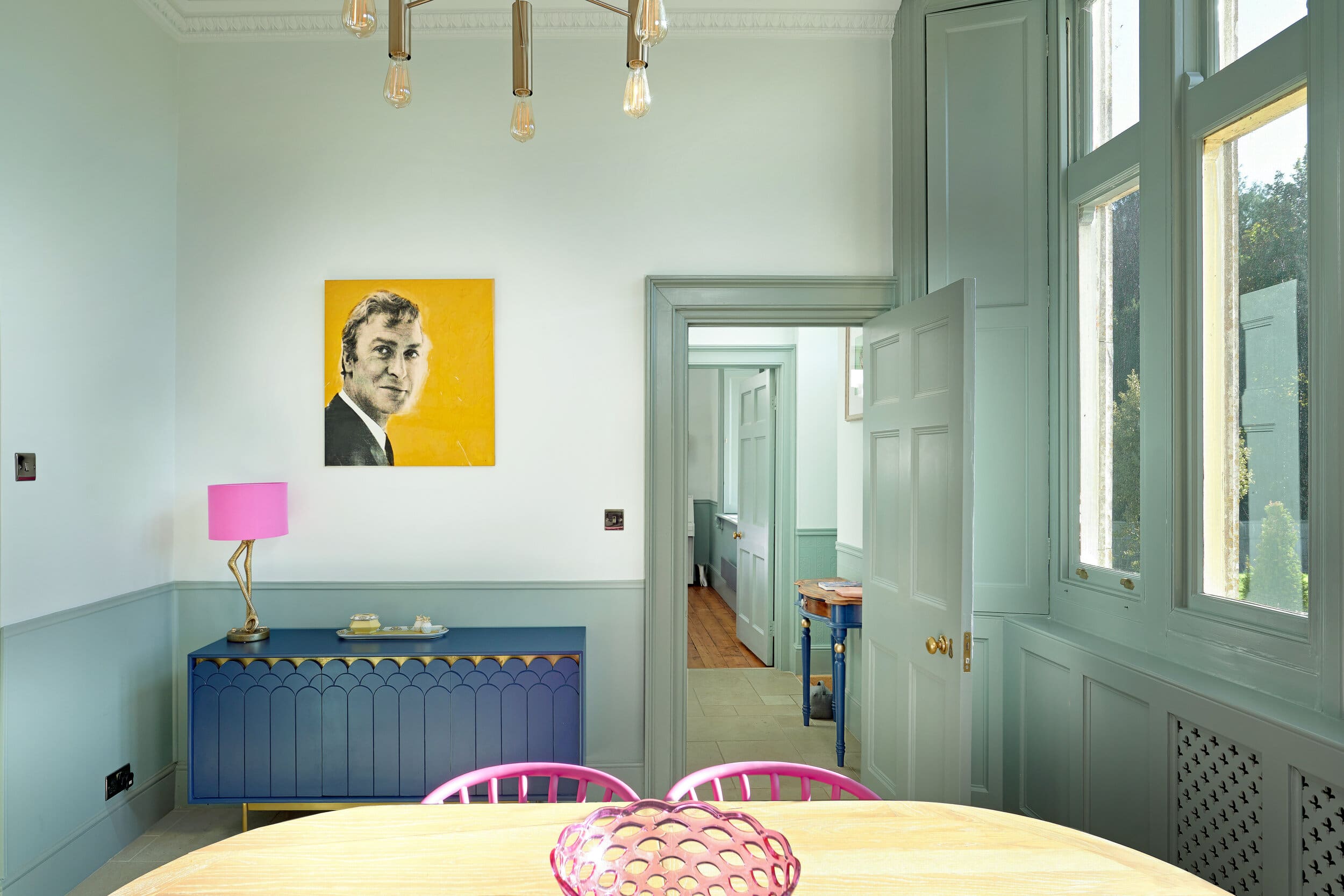
Using the same interior rules as we would with strong colours, ie 60% dominant, 30% secondary and 10% accent, a neutral palette can easily be as stylish as a ‘colourful’ design. Staying within a tonal palette is also important – picture a hint of petrol blue or gold and a touch of black or brown across an all white chalky base for example. Then applying other principles that I’ve also mentioned before like textures, layers, and unique pieces of art and you’ve got the most elegant, relaxing neutral interior…but with a twist!

The natural lighting of a room can help direct your colour choice
When it comes to choosing your starting point, your primary neutral, the first thing to consider is the natural light in the room. In a north-facing room, straight up white isn’t going to cut it and will struggle to lighten the space. The cool toned natural light will showcase the cooler tones of a colour, so you should either embrace that and go down a sophisticated grey/green route, or better still counteract it with warmth, using neutrals with rich undertones. Similarly, your accent colour will need to perform the same function, so blues and greens for the cool approach and spicy rich colours to warm up a room.


So, if you’re struggling to decide on a colour scheme for your next interior design project, or you want to create a zen calm, natural environment to escape the hectic world outside, why not consider my take on a neutral look? It will stand the test of time and always look stylish, then while everyone else chases the latest trends and frantically redecorates year after year, you can take a deep breath and relax…!
And if you need some help and guidance, drop me a line to see how I can help!

Leave a Reply