Style stories
Working With Bold Colours and Patterns
Have a scroll through a property website and compare a dozen living rooms – notice how those with colour, patterns and accessories look more comfortable, stylish and inviting, than the magnolia empty ones? Then look at the real standout ones – I bet they feature some vibrant colour somewhere, because bold colours are very definitely on trend. (Check out our blog post earlier in the year on interior design trends for 2020). That said, it would be a crazily daunting leap for anyone to immediately start painting their white bedroom walls blue or their kitchen bright green, so how do you choose when it comes to bold colours and where should you begin?
The Basics
As always, you’ve got to take a step back and look at the canvas you’ve got to work on – the size of the room is an obvious starting point. In a small space, four block colour walls will be overpowering, so an accent wall will be your style statement.
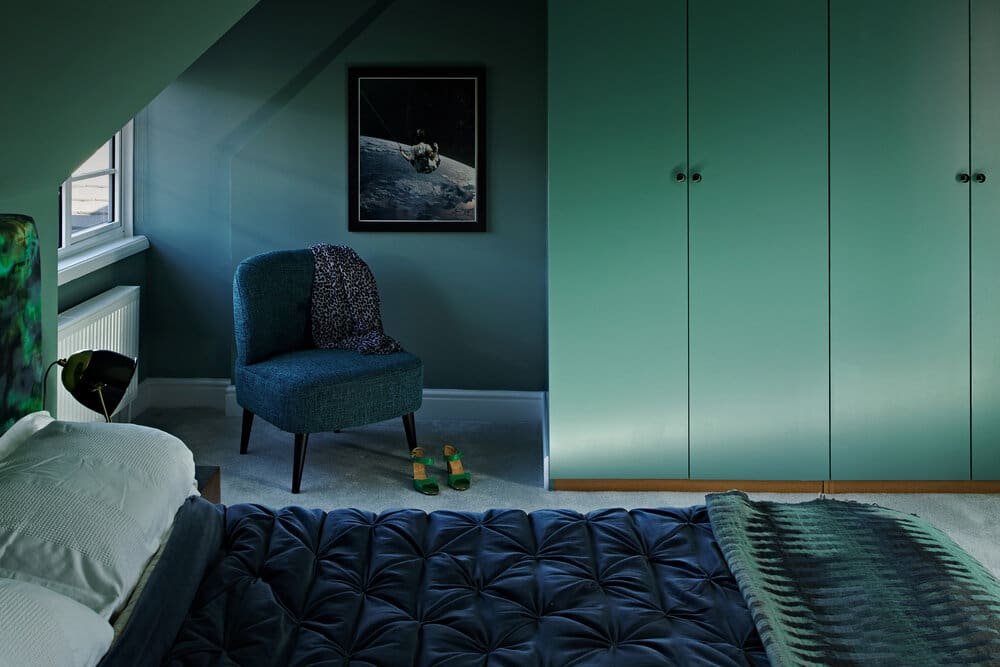
Larger rooms can handle complete colour, but again, too many contrasts elsewhere in the space will be visually overwhelming. Then consider where you want to make your colour statement – bold colours are often used successfully in rooms where you want to make an impression, so a living room or an entrance hallway are popular, and any kitchen diner that entertains or is the hub of the house will also work. It’s less common in bedrooms where you might prefer a more calming environment.

The Palette
Bold colours always need something to play off, which is where your colour wheel from your old school art class comes in handy! You need to consider complementary hues, as well as the same harmonious tonal family. You can see plenty of examples in fashion, art and even nature. Whether you’re a fuchsia and olive-green person or a navy and orange fan, don’t dive in straight away, plan carefully and don’t forget your neutral shades.

The eye needs some respite in a bold colour room, so use your most vivid colour as an accent colour only. Designers often use a 60/30/10 rule for dominant/secondary/accent colours and it’s sage (a good neutral!) advice to achieve the right balance. If you’re nervous about choosing your colour scheme, then don’t forget to test things out – a step up from a paint tester pot is to spray paint an old piece (a wooden chair, say) in your bold colour and see how you feel. Another great way of deciding which colours work together is by picking them from an existing pattern that you like and can incorporate, which leads us nicely onto:
The Patterns
Pattern is the ultimate unifying device for your colours and can single-handedly bring a design together in one well-chosen accessory. When done well, you might not even notice that an intricately patterned cushion on a neutral sofa is cohesively marrying both the wall colour, a rug, and your vibrant chosen accent colour. While I’m not suggesting you base the room’s entire scheme around a cushion pattern, they are a great inspiration if you’re stuck. Textiles are the best place to incorporate pattern, and they often throw texture into the mix too, which is great. As for the pattern design itself, a lot will be personal choice, but botanical patterns work well with greens and earth tones, for example, and graphical designs suit more architectural black and white and greys.


Leave a Reply